Language
Print-Ready 2025 Calendar Templates Are Here!
Explore Now
Add your logo and insert custom date information to create your perfect calendar today!
General Artwork Guide
This guide should be followed every time a design is started, regardless of the product being created. The points mentioned below are considered “Best Practises” when designing for print and will apply to all products. More detailed guides are available for specific products or product groups.
Main Elements When Starting a Design For Print:
Format
- Ensure the artboard/page is set to the correct size
- For books, the artboard(s) should be set to the final FOLDED size of the book
- For all other products, the final TRIM size should be used
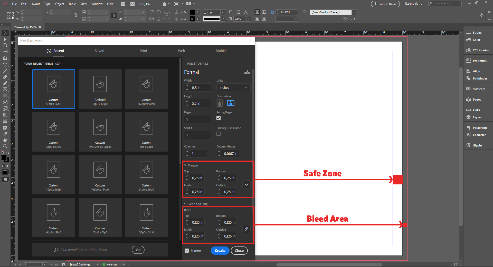
- Bleed should be allowed using the built-in features of Indesign and Illustrator, and NOT by making the artboard bigger
- It is not enough to just have the bleed box allowed, any background images, shapes, or other design elements that go to the cut edge of the piece should extend out to the bleed box
- All important elements that ARE NOT supposed to bleed should be a minimum of .125” (⅛”) from all edges of the piece. This is known as a Safe Zone or Safe Margin.

Colour
- The Colour Space should be set to CMYK, and instead of RGB
- Colours can be converted, but there is no guarantee that the colours will print as intended, and orders will not be reprinted for colour issues if the file had to be converted from RGB
- Pantone colours should only be included in the design if the final piece will be printed with Pantone inks.
- Colours can be converted, but there is no guarantee that the colours will print as intended, and orders will not be reprinted for colour issues if the file had to be converted from Pantones
- Grey elements can be used in the design, but they should be made up of only Black (K) ink. If there are any other colours in the grey, it will create a colour cast in the element that should be pure grey
- Large areas of black or titles and headers that use thick, large fonts should use what is referred to as “Rich Black”. The formula for this is as follows:
- Cyan= 40%, Magenta= 30%, Yellow= 30%, Black= 100%
- Any thin lines, fonts, line art, body text should be made up of 100% Black (K) only. If there are any other colours of ink in any of these elements, there is a chance that the final print will end up blurry due to the various colours of ink not lining up perfectly
Resolution
- DPI stands for "Dots Per Inch" and is a measure of resolution.
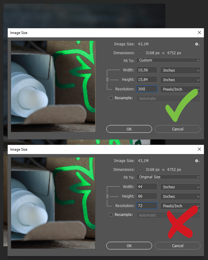
- All images that are placed in the document should be a minimum of 300 DPI.
- Images that are to be used for the web are normally 72 DPI, and CANNOT be used for print output
- The resolution of the document should be 300 DPI
- When exporting, ensure that any downsampling applied to the file in the PDF export process does not go below 300 DPI

Fonts
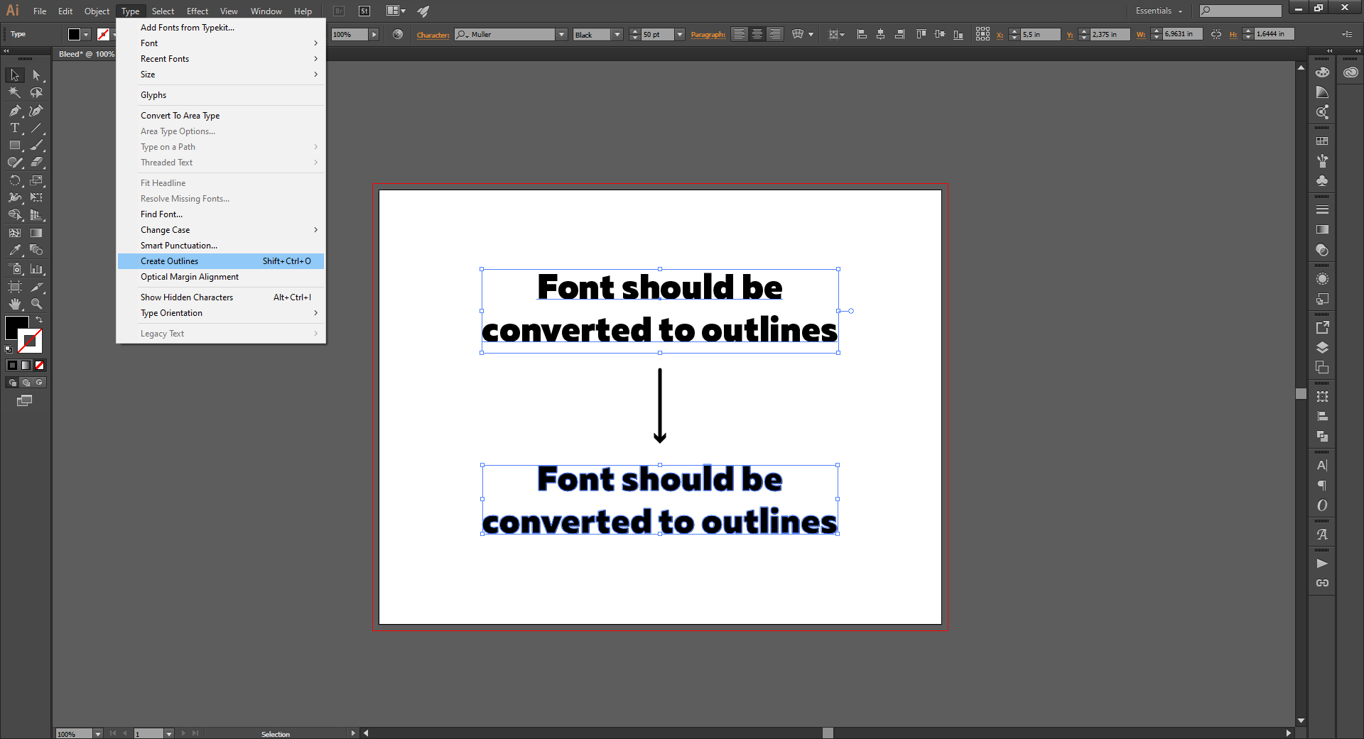
- If the design uses a font downloaded off the internet, it should be converted to outlines prior to submission for print. Make sure to save the file with the outlines fonts as a copy, as once the fonts are outlined they cannot be edited

- Make sure that the PDF does not contain any form fields. This is common when a template is received from a head office or corporate headquarters and the location-specific information can be filled in. However, if these fields are not flattened prior to file submission, the information in the fields will not print on the final piece
- All lines should be at least .25 PT, as anything thinner than this might not show up on the final print.
- Borders around the outside edges are not recommended. Due to the mechanical cutting process, there is no guarantee that the margins will always be consistent. If the design absolutely must have a border, it should be a minimum of .25” thick