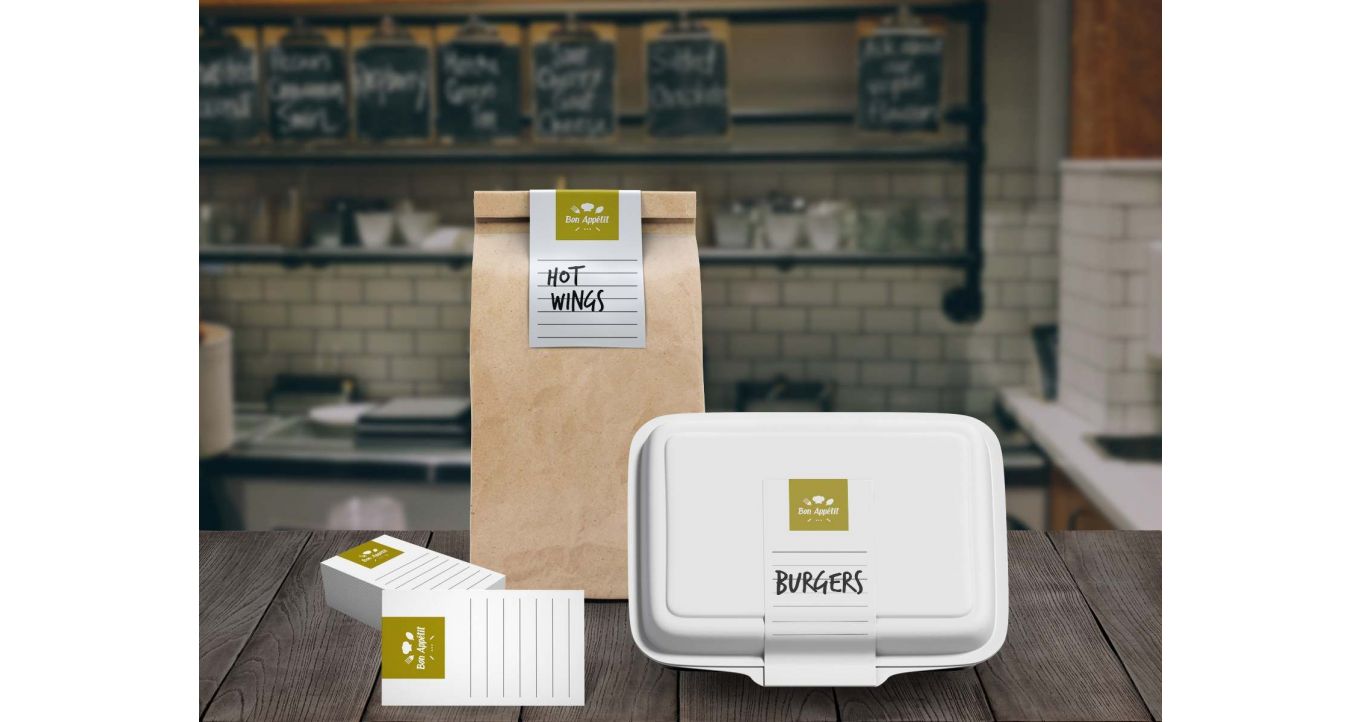
Brochures are a very relevant and powerful tool used to spread your company's message. We are sharing our tips on how to design a brochure that draws attention.
In the digital era that we live in, you might be wondering why you need “old-fashioned” printed marketing materials. This fact may surprise you, but studies have shown that physical advertising media is more action-oriented than digital media. And your end goal is for your customers to take the desired action.
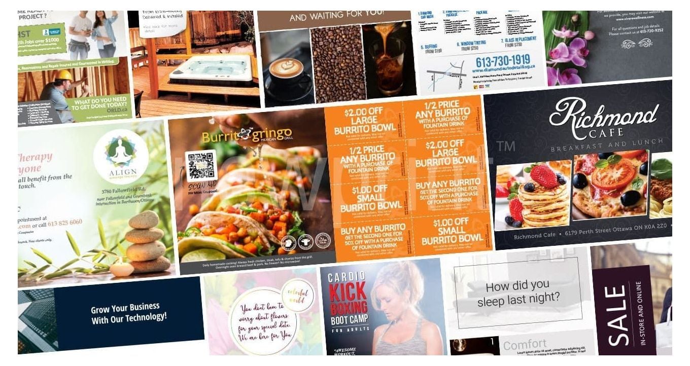
One of the most used and most effective printed marketing pieces is a brochure. It is a promotional document used to introduce a company, product or service, inform of the benefits, and extend the reader’s knowledge on a specific topic. There are many possible ways to use a brochure, but the most common ones are:
- as promotional mailout and part of giveaway packages
- as product instructions
- as literature for business services
- as maps for parks and trails
- as menus for restaurants
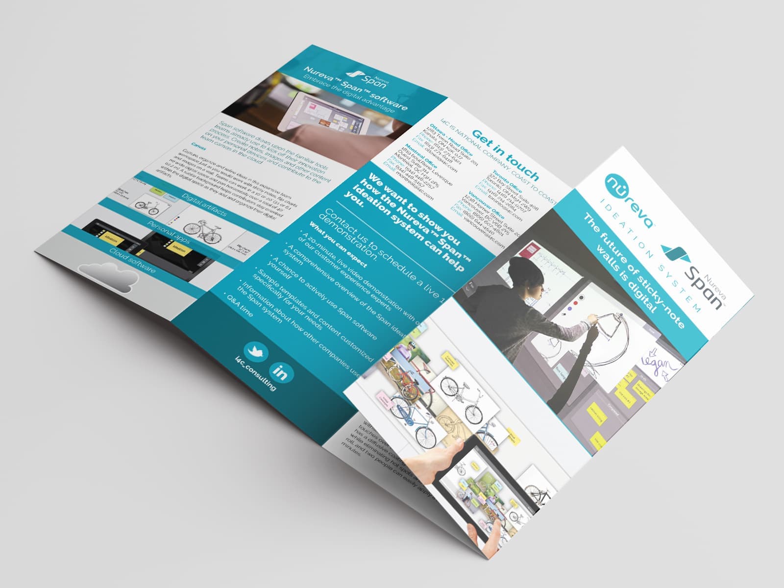
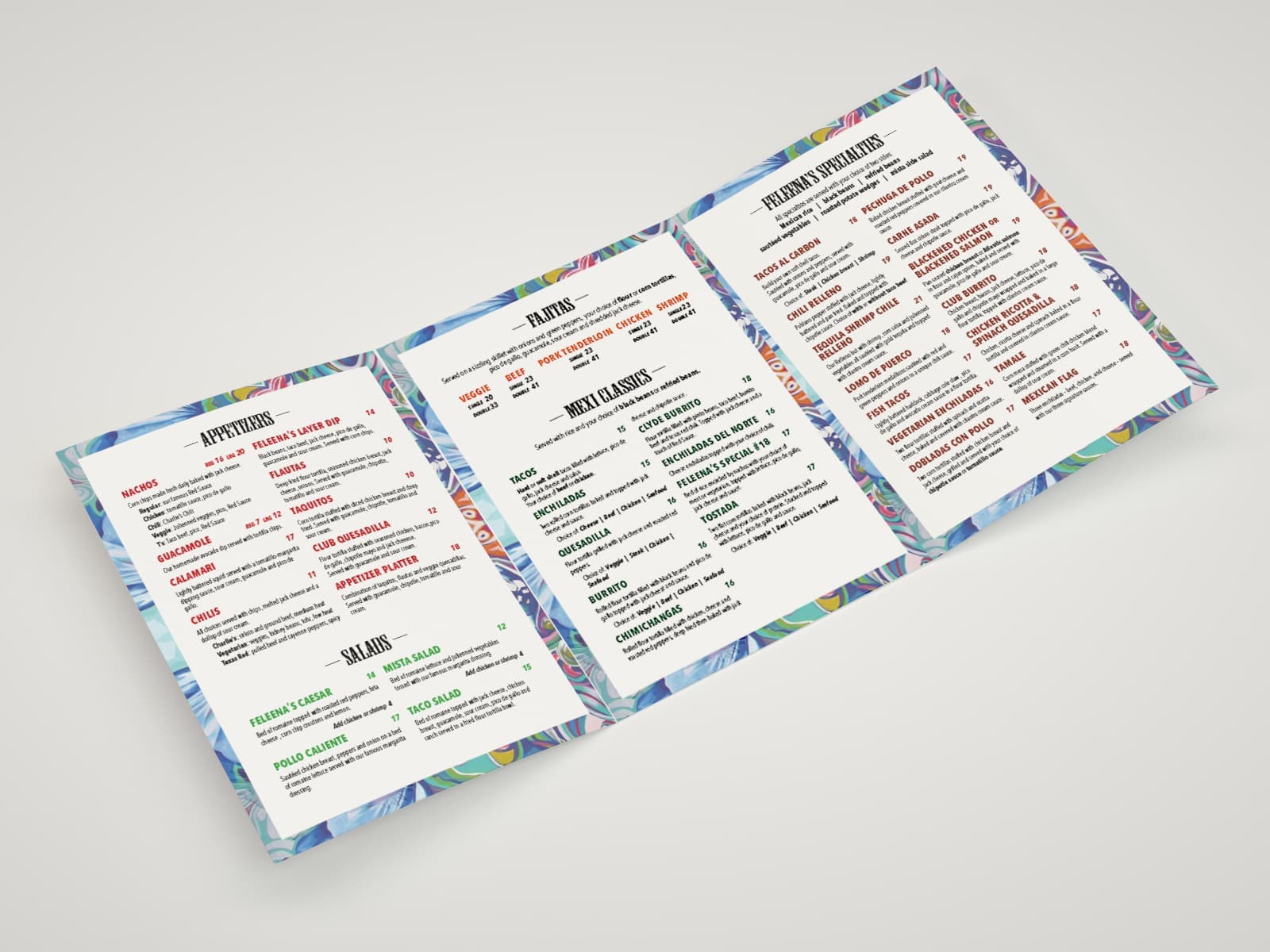
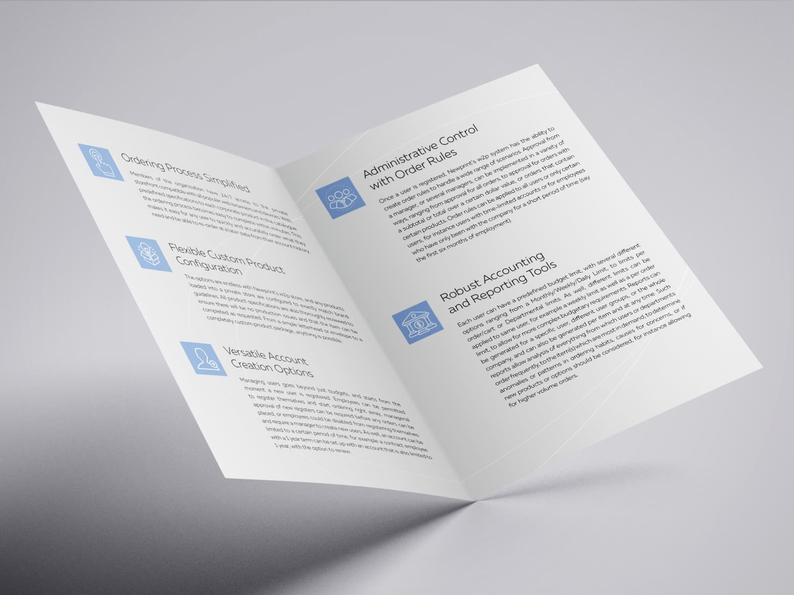
There are a few main benefits of brochures you should take into consideration:
- They are versatile and easy to distribute
- They are cost-effective
- They can hold lots of information, and a person can refer them again and again
- They build trust and personalize your business
- They are easier to understand and remember than digital advertising, as certain studies show
Design a brochure that attracts the customers
Our most important tip on how to make a brochure is to make sure that you are well prepared. That usually means the following:
KNOW YOUR BRAND -
Every piece of advertising you create should correspond with the general message your business wants to send. Brand recognition is essential, so make sure your colour scheme, imagery and message are consistent.
HAVE A CLEAR IDEA ABOUT THE PURPOSE -
Is your brochure informational? Do you want the reader to know more about your business? Does it introduce a new product or service, and you want the person holding it to go and buy what you are offering? The layout of the brochure should guide the reader to take the desired action. That’s why it is best, if possible, to focus on promoting a single action.
KNOW YOUR IDEAL CUSTOMER -
Use the language and images appealing to the person you think your ideal customer is. Remember, if you are trying to appeal to everybody, you will probably reach nobody.
SET YOUR BUDGET -
When you decide to design a brochure, there are multiple factors to consider. The type of paper you should use, the brochure size, quantity needed, printing options, hiring a copywriter and a designer or not are some of them. It would be best to make an informed decision based on your priorities and the brochure’s purpose.
When it comes to brochure type, there are more options than you probably know. Some of them are:
- Half-fold
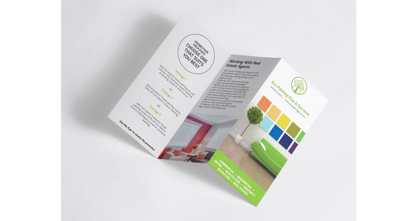
- Tri-fold
- Z-fold
- Accordion fold
- Gate fold…
- … and the list goes on
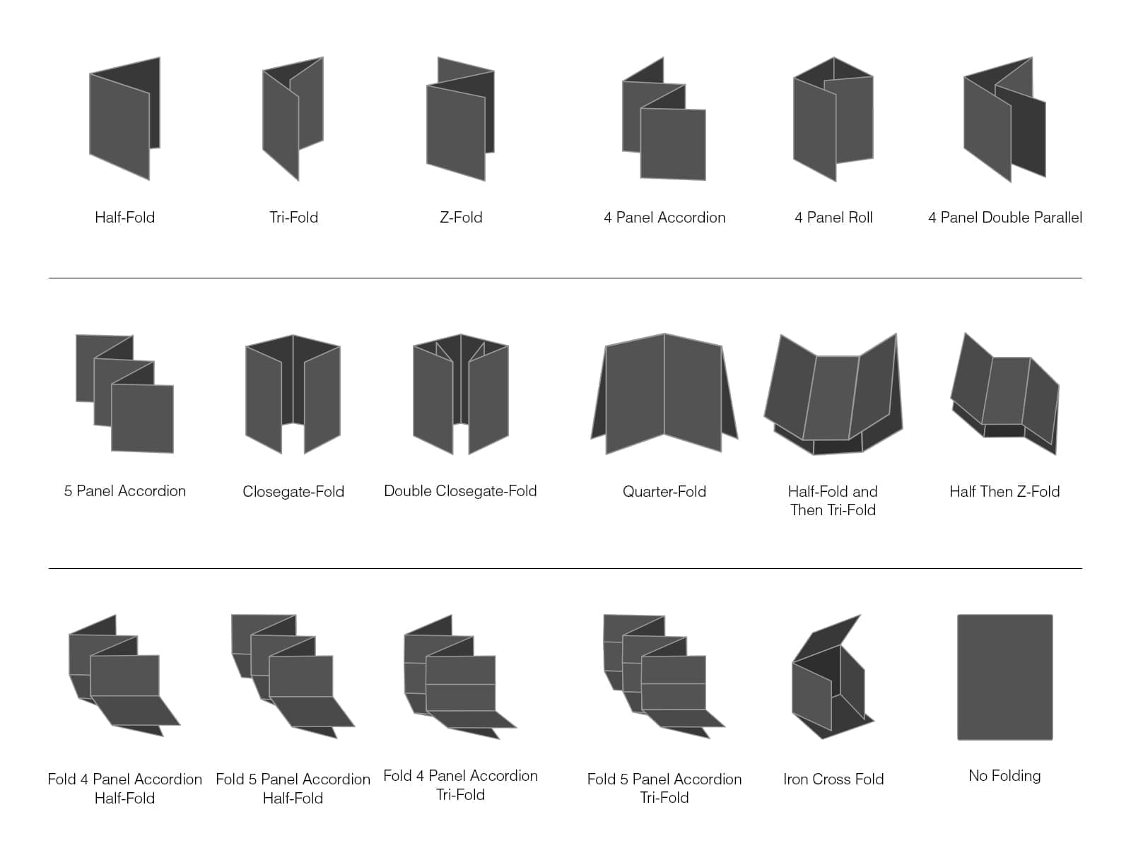
Paper size and fold type will depend on the amount of information and the purpose of your brochure.
The front page should have a single, clear, targeted message, and it should grab the reader’s attention. Some of the methods are:
- Explain how you can solve your customer’s problem
- Build intrigue by proposing a question
- Let the product speak for itself
- If the brochure is informational, put your branding front and center
The main brochure content should be concise and skimmable. There shouldn’t be too much explaining. Graphs, charts, and images with as little text as possible usually work best.
CTA (call to action) should be easy to understand and follow, and all content should lead the reader to it.
The back cover should include extra details, such as contact information and your social media profiles.
When it comes to the visual aspect of brochures, it all comes down to who they are for. The brochure should appeal to your audience, not the brochure maker, and different groups prefer different visual content.
We have already mentioned that colours should correspond with your brand colours. Furthermore, having one primary colour and one or two secondary colours dominating the paper surface usually creates a more professional look. This approach is typical for corporate brochures and product/service presentations. On the other hand, if you want to design a brochure aimed at children, or to promote a fun outdoor activity, it is ok to create something more colourful.
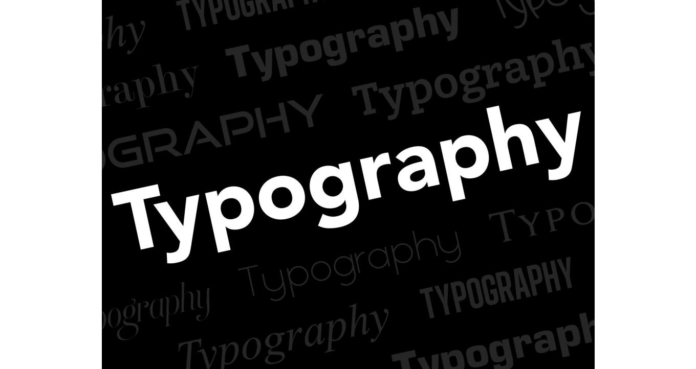
You can apply a similar principle to choosing a typeface. When creating a corporate brochure, it doesn’t make much sense to use fonts from comic books and superhero movies. A good rule of thumb is to use up to 2 different typefaces in your design – one for headlines and call to action and the other for text paragraphs. The latter should be clean and easy to read. At the same time, the headline typeface can be more playful and dynamic, all depending on the overall design style you’re going for.
Another thing to keep in mind is font size. If you end up having a lot of text, you may be forced to use a smaller text size to fit all the information in. This could make your brochure hard to read to many people, so in this case, it’s better to cut some text down or rephrase it to fit better. Plus, having less text is also visually more appealing. Keeping your paragraph font size between 10 and 13 pt is what you should be going for.
Using images is very common in brochure design. They can showcase your products and services, illustrate your slogans and emphasize your overall message. One thing to pay attention to here is image resolution. For images to print nice and sharp, they need to be high resolution. This means that most of the images you can download online won’t work since those are low-resolution web images. Suppose you don’t have your own high-resolution images. In that case, there are online platforms that sell professional photos big enough to print. Good places to start searching for photos are Istockphoto and Shutterstock. Or you can hire a local photographer to take the images you can use for advertising.
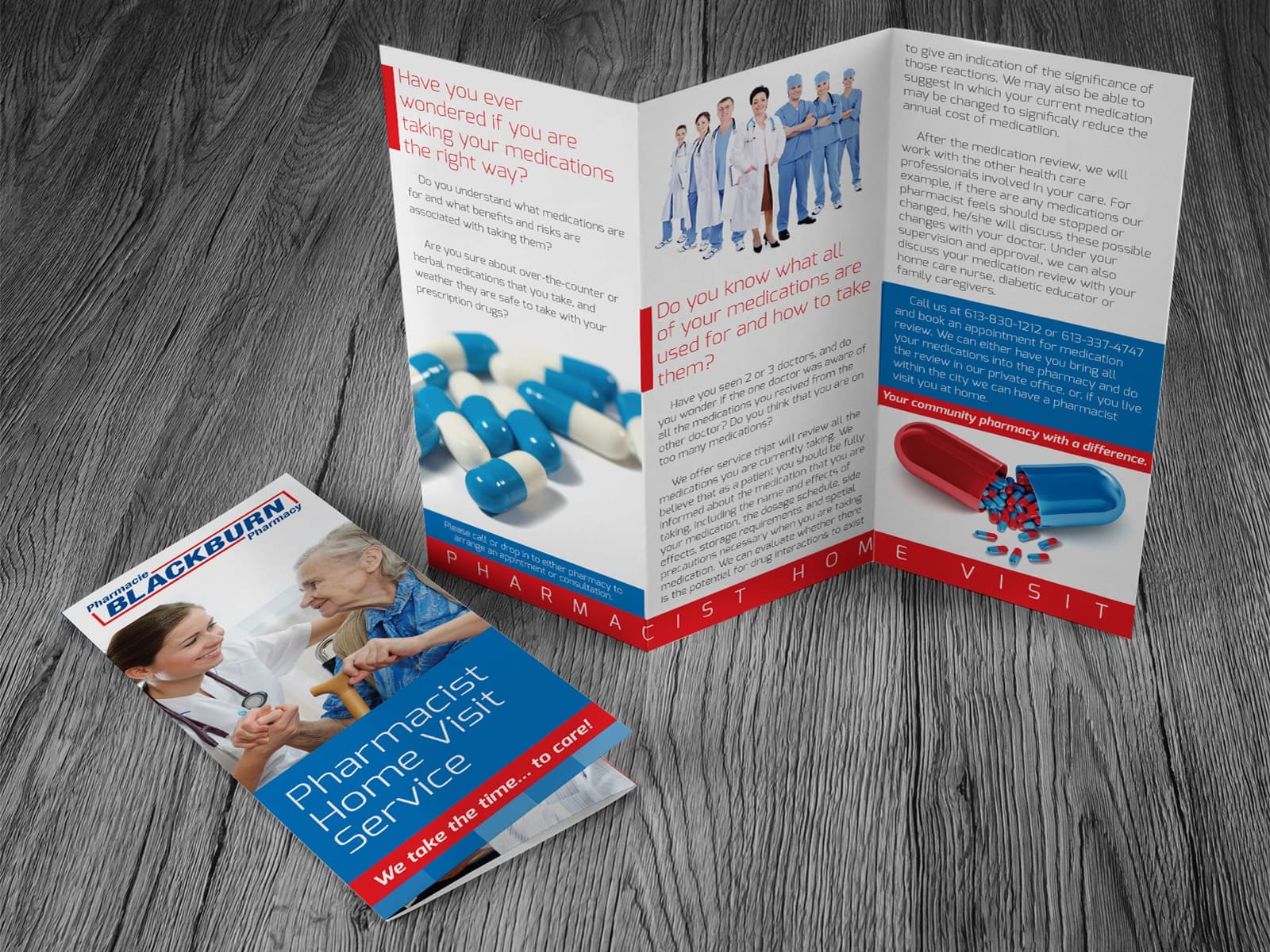
Where to start when you decide to design a brochure
You now know the basics of how to make a brochure. But if you are not sure how to start and set up your design file, we have prepared template files you can download from our website. The process is visual and straightforward to follow. If you need extra information about some of the options, you can click on the i icon and read a short explanation.
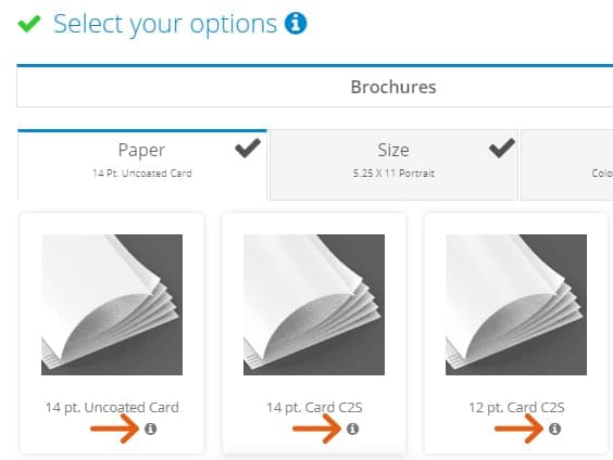
To download a Newprint design template, go to brochure product page, where you will find 6 categories to define the type of your brochure:
1) Paper – Here you have to choose the type of paper you want us to print your brochure on.
2) Size - This refers to the paper size when the brochure is unfolded.
3) Colours - Here you choose whether you want printing on both sides or just on the front side.
4) Coating – This option allows you to enhance the finished brochure’s look by adding extra layers of coating, such as gloss or matte.
5) Folding – Choose the fold type for your brochure. The folding you choose will create a certain number of panels on your brochure, so you have to design the brochure with these panels in mind. Our templates will be of great help here because the panels will be clearly marked on the template file.
6) Packaging – In this step, you can choose how you want us to deliver the printed brochures.
Once you have chosen the options above, you will be able to download a design template based on your selection. The 3 icons represent 3 different file types for your templates – ID (requires Adobe InDesign to edit), PDF (requires Adobe Illustrator to edit) and AI (requires Adobe Illustrator to edit). Click on the file type you prefer and save it to your hard drive.
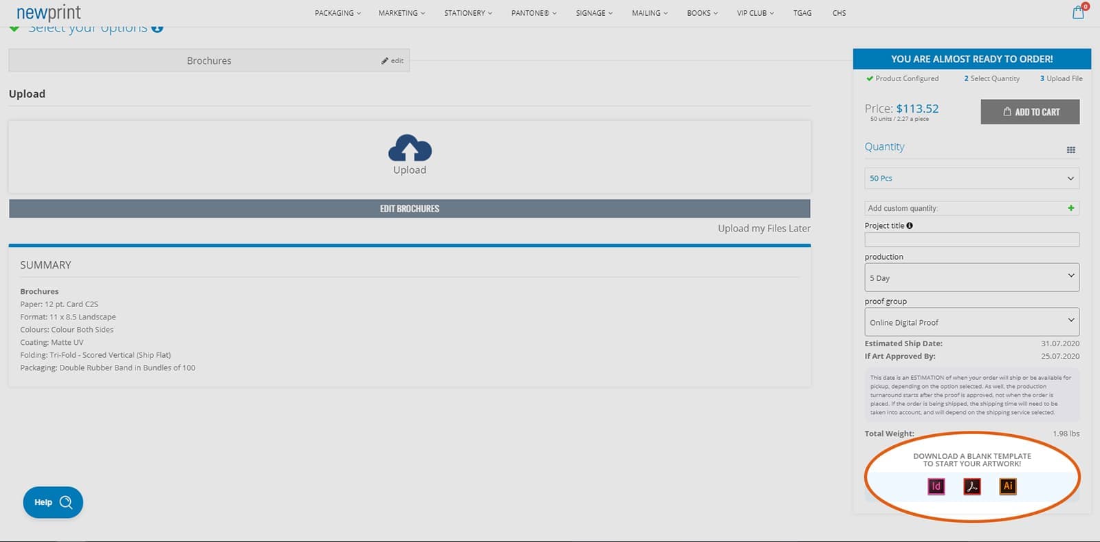
For more information on how to download Newprint design templates, visit our help section.
We have also created detailed instructions on using InDesign, Illustrator and PDF templates from Newprint to make your design process go as smoothly as possible. These instructions also explain how to export PDF files correctly, so you don’t have to worry about whether your files are print-ready or not.
In case you would like our designers to help you with any part of the design process, or to help you transform your idea into a finished product, contact our support team and let us know what you need. Our team of creative professionals is here to assist you in making the right choice for paper, colour and finishing options and designing an excellent brochure for you. Alternatively, you can find a freelance designer for your project using platforms like 99designs or Upwork.
Are you ready to design a brochure your customers are going to love? Visit our brochure product page to order your brochure printing online and let us know about your project!
