The hang tag of your product is often the first thing a customer will look for when they see your product. These well-designed hang tag examples can help you get ideas on how to attract customers' attention.
You may think hang tags aren't instrumental, but that couldn't be further from the truth. The hang tag of your product is often the first thing a customer will look for in the store. Of course, it's your beautiful product that will catch their eye, but if the tag they read doesn't live up to the expectation that the product has set, they might just put it down and move on. Hang tags are not just a barcode, price and brand name, they are so much more. It's what gives your product identity, personality, and life. The tag doesn't have to be mind-blowing to be effective, but it must be functional and reflect your brand. When done right, a hang tag can elevate the product and be one of the decisive elements.
Here are a few hang tag examples of inspiring hang tags that would catch customers' eye and keep their attention.
1. SKIVVIES
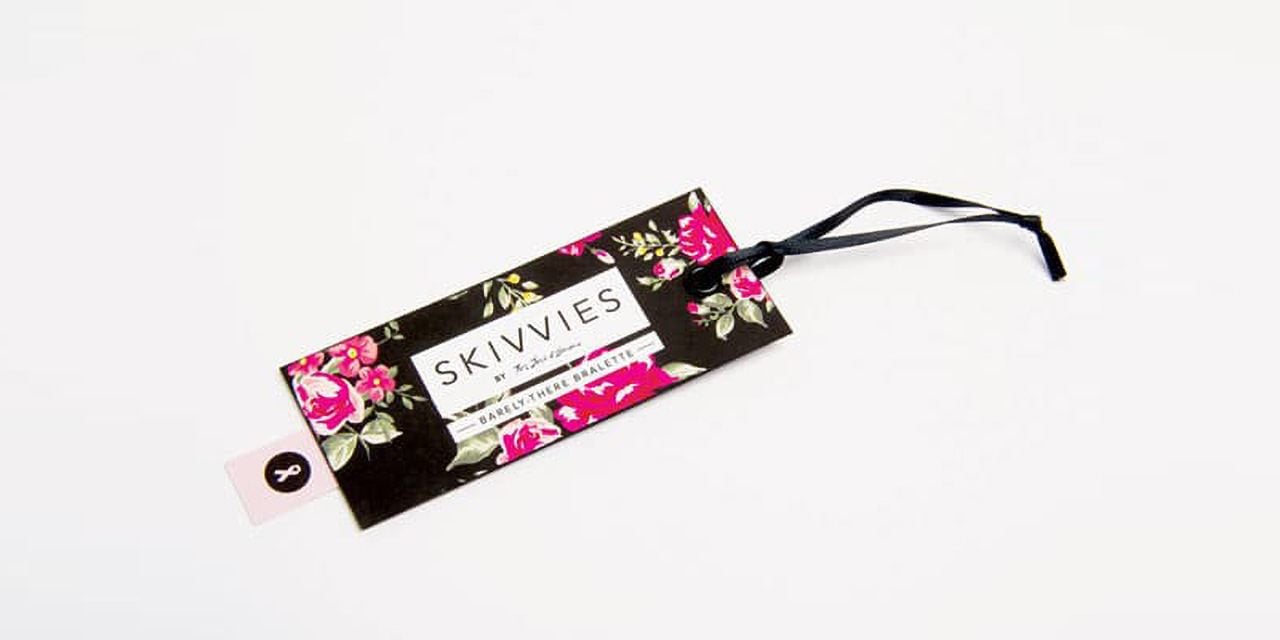
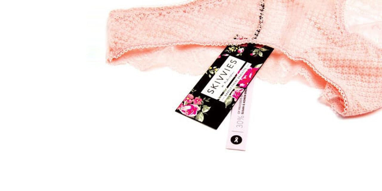
This lingerie company knew its brand and decided to use the floral pattern on its hang tags to give a simplistic yet elegant look. The thin pink ribbon in the back and the silk ribbon handle add to this look and give the brand a high-end, sleek feel. This is what most customers are looking for in a lingerie brand.
2. Hang tags for weddings
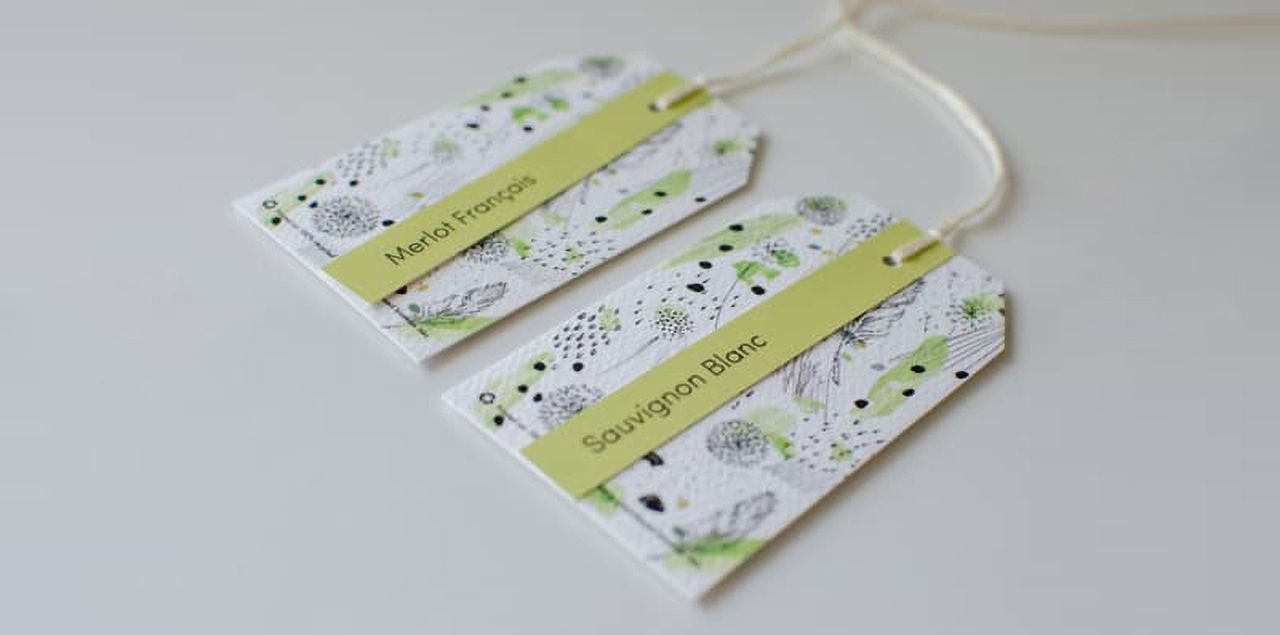
These wine bottles hang tags were used at a forest-themed wedding. The forest theme is reflected not only in the creative hang tags design but in the chosen paper as well. The minimalistic components of nature in the background give off a subtle forest theme and the paper has a textured surface, perhaps reflecting an uneasy ground or another rigid part of nature.
3. ZIGS BEES
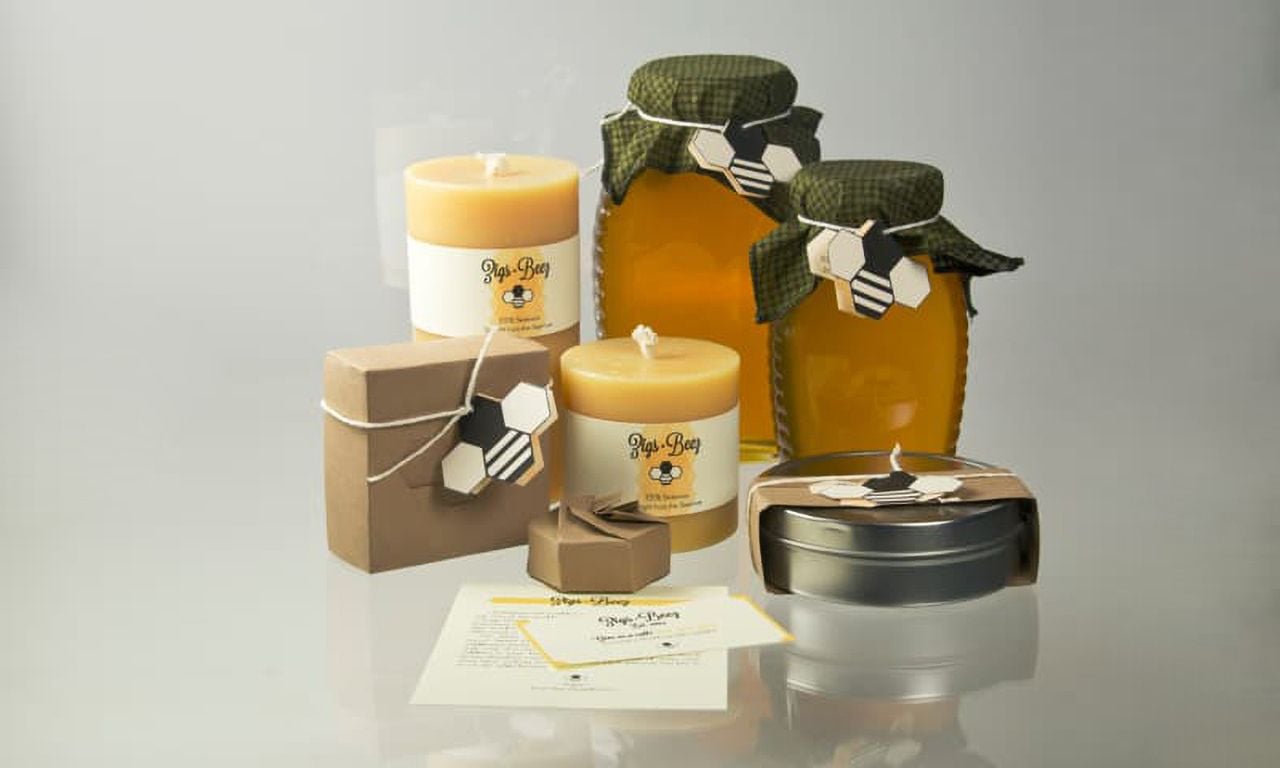
These hang tags not only reflect the product and its brand, but they do it with a clever visual trick. At first glance, these tags are in the shape of a honey bee, but look again and you'll see a honeycomb, too! Customers appreciate tricks like these and it can sometimes be the deciding factor for them to choose one brand over another.
These adorable little hang tags are a perfect example of what we call a die-cut hangtag. Die-cutting means that a print can be cut out in any shape you'd like.
4. WE HAPPY FEW
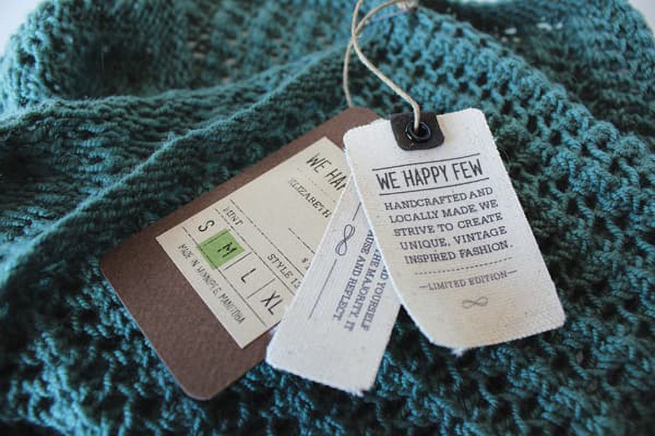
These hang tags are not only fashionably layered but they also mix the use of paper and fabric printing. This brand chose well to reflect their handcrafted merchandise. Having a layered tag with fabric and paper reflects that rustic feel they want to achieve.
5. HOMEMADE JAM
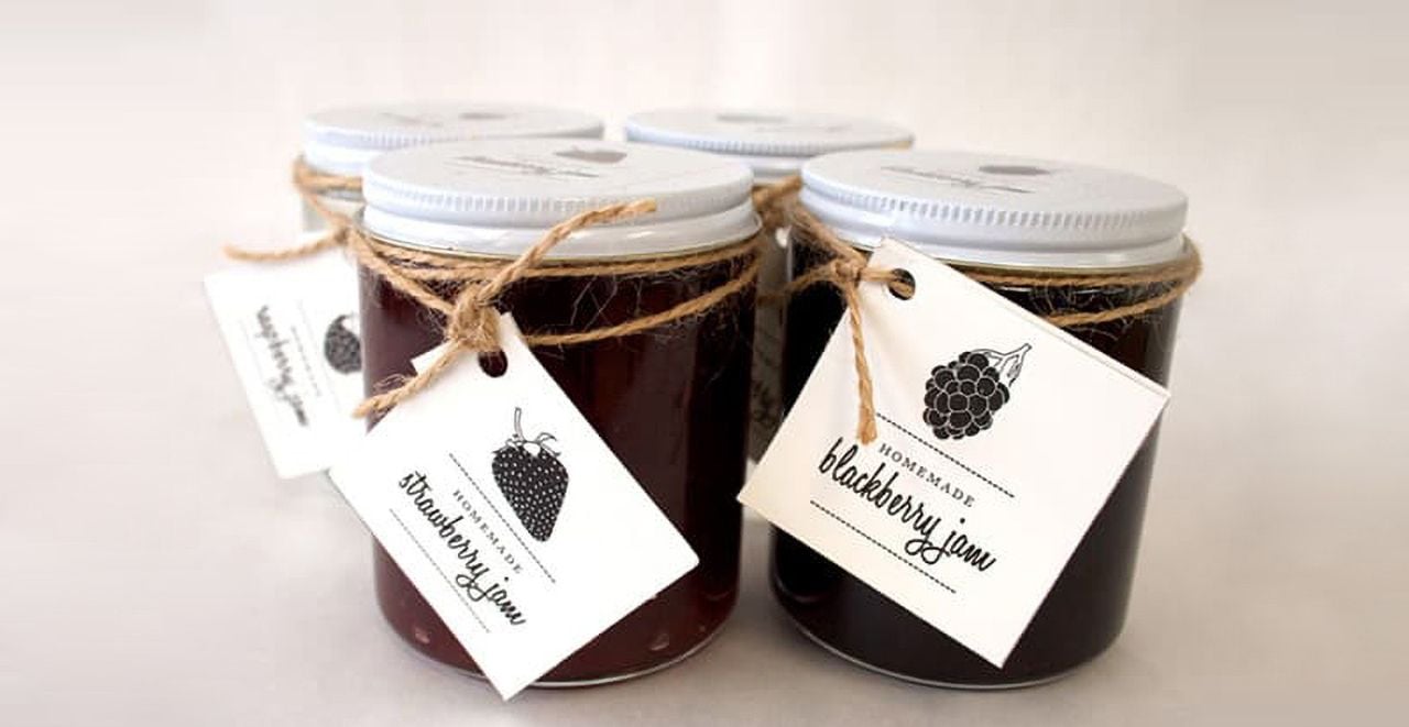
These tags have a bit of a different look than the others. Although the design is minimalistic, you can tell it fits the brand. When you're buying jam, you want to know it's pure and fresh, and this creative hang tags design uses white space to give off that impression. The twine used could remind one of farming, home, or small-town life. It's a comforting reminder and the consumer will assume quality thanks to the way the hang tag was designed and placed.
6. SMITH & WESSON
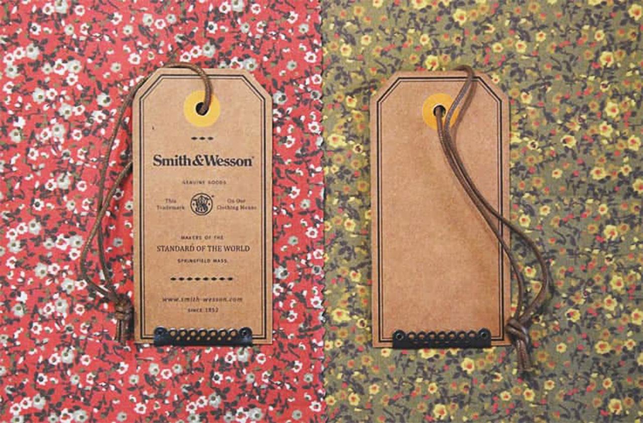
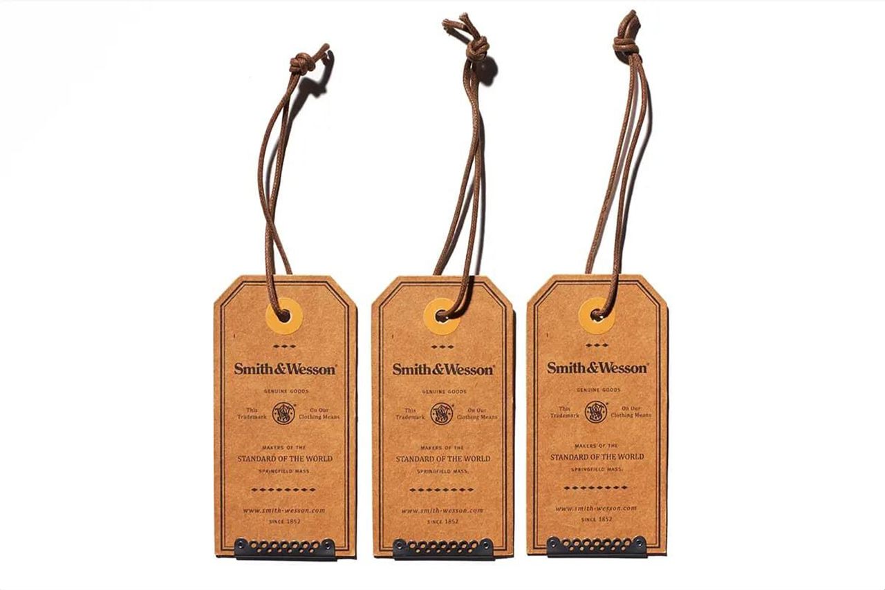
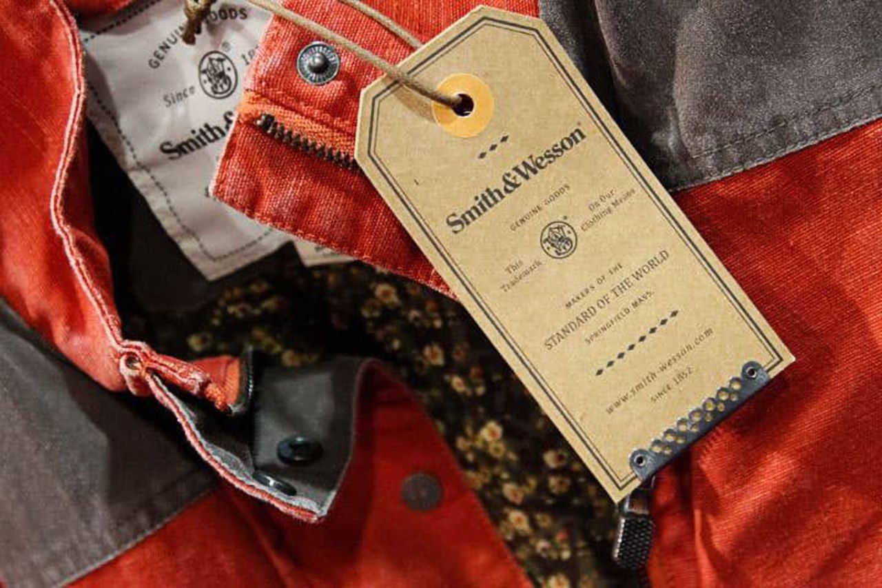
These hang tags look more traditional to best reflect the brand. This brand uses a rustic feel to appear vintage. What may tie this whole tag together is the thick string used on the top, which really tops off the vintage feel they're going for.
7. RIVER MOON
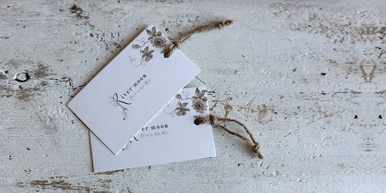
Here we have very simple hangtags featuring just the brand logo and a small floral design in the corner. This flower arrangement company brands itself as very earthy as is illustrated by the natural tones they work with. Twine once again reflects that successfully.
8. "ENJOY" HANG TAG
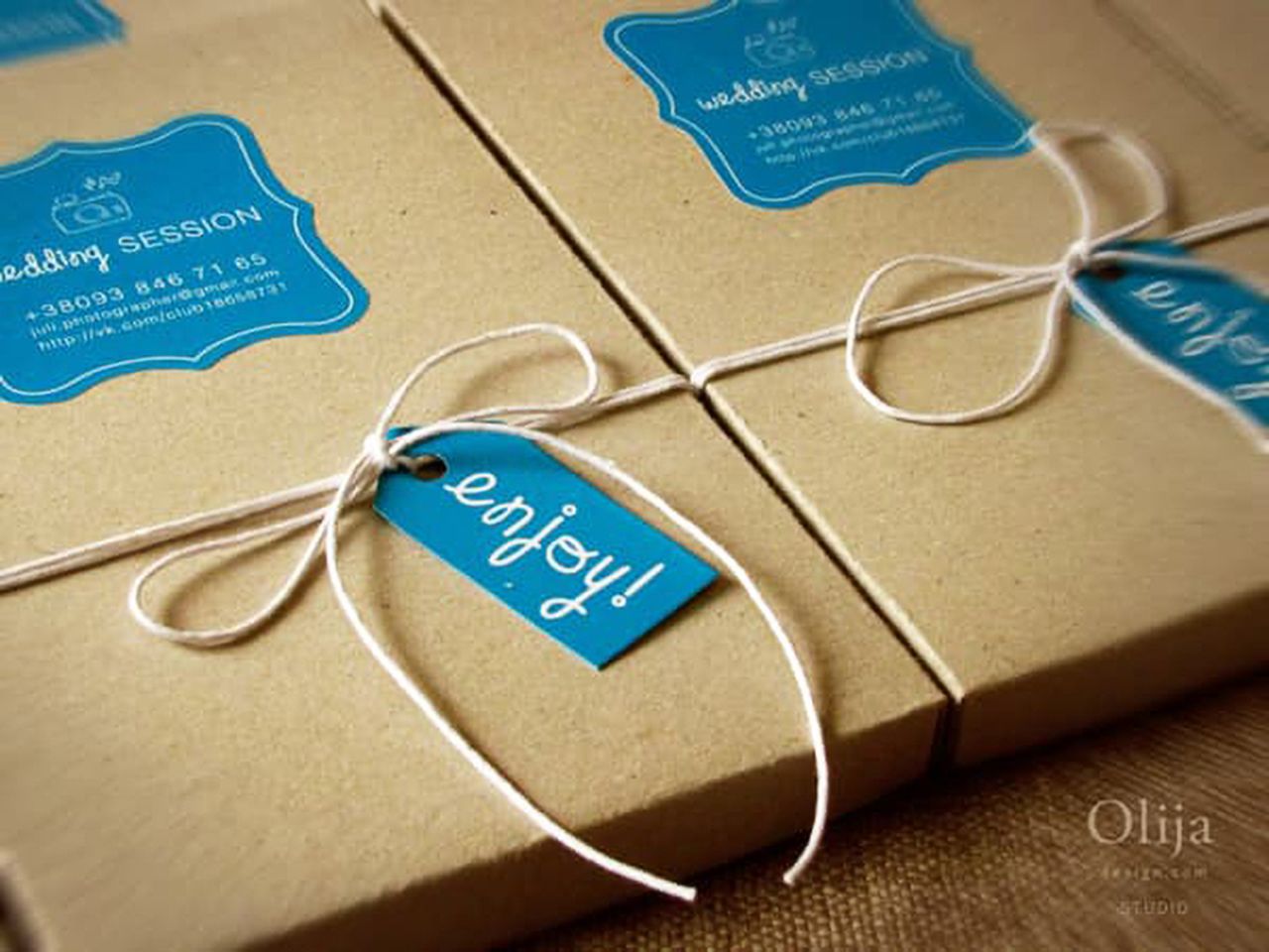 p>This very basic hang tag example doesn't define the brand the way the others do. The brand personality for this photographer can be seen on the box's label which gives the customer all the information they need. The hangtags in this situation play a very important role in the brand's identity. If this box only had the label with the info on it that would be fine, they would know who took their pictures. But, a simple touch of string and a friendly "enjoy" changes everything. This makes it seem like a gift they're receiving and even if it only makes them smile once, they won't forget it and definitely won't forget the brand.
9. PET SUPPLIES PLUS
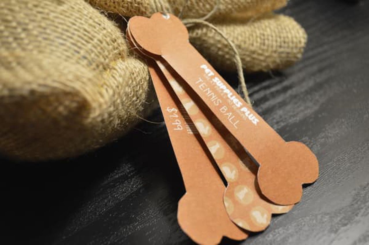
These, once again, layered hang tags are very cute. Their simple shape reflects the brand. Creative hang tags design like this is so simple but so effective as well. Customers appreciate simple references and remember the uniqueness that sets these tags apart from basic alternatives.
10. NUTTALL
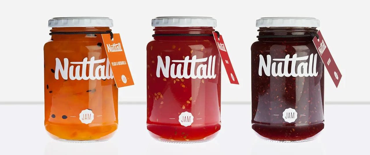
Sometimes you don't have to create anything new to be effective and creative, as these hang tags effectively convey. They feature only the product logo and the kind of jam. Simple enough, right? What ties this all together is the consistency in having the tags be the same color as the jam itself.
11. "HAPPY HOLIDAY" HANG TAG
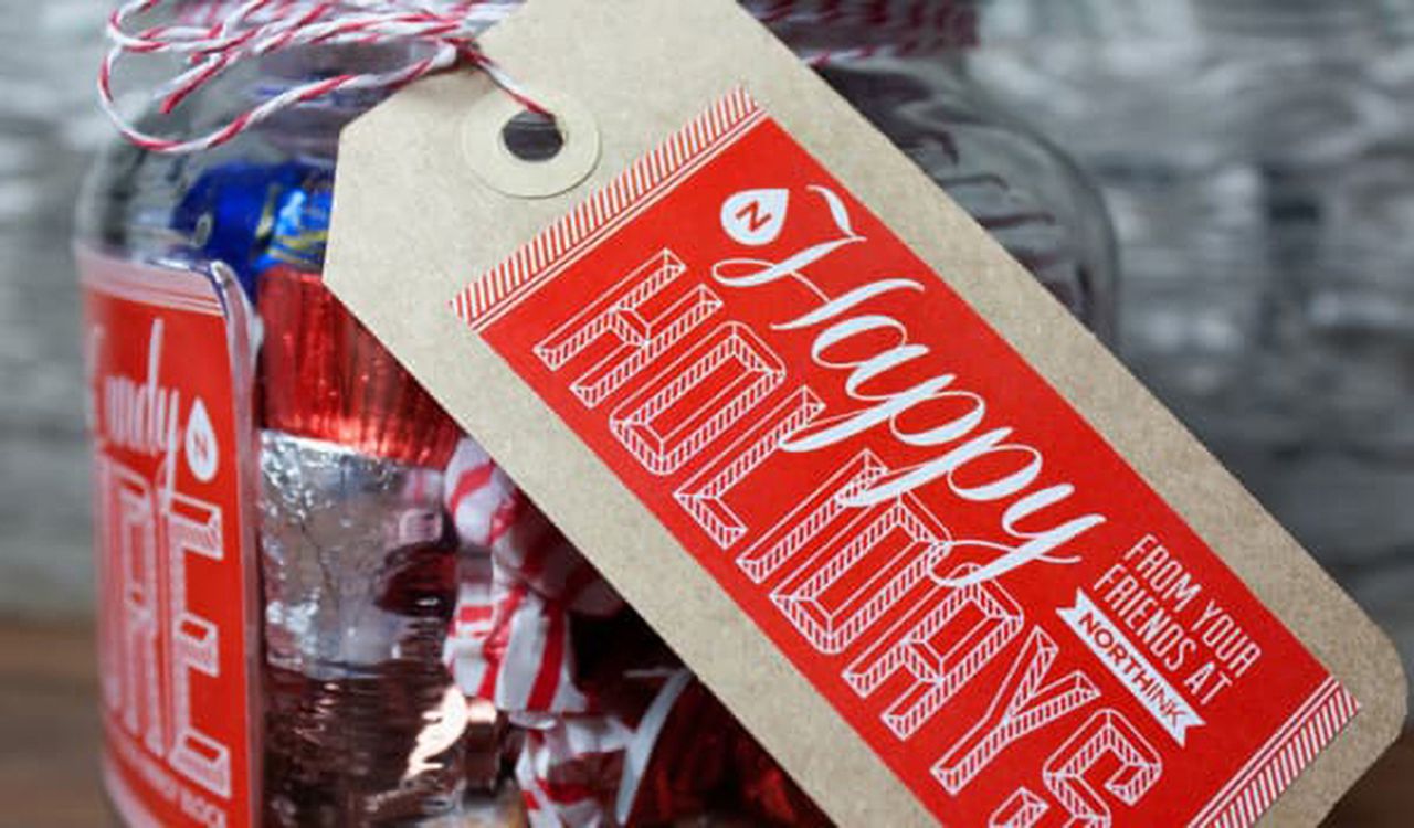
The classic gift tag look featured here goes very well with the timing when they were used. Gifts between loved ones are part of what can define the holiday season. The actual design on the sticker used is perfect for the holidays due to the candy cane border and the red background which ties together the holiday theme.
These hang tags are also a great example of using stickers to create your tags. You can choose between Roll Labels or Cut Sheet Labels.
12. MOON FOX
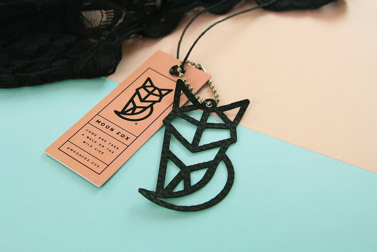
A stark elegance highlights the simplicity of this tag's design. The overall figure of the "Moon Fox" is readily apparent through the use of various individual shapes. Intricate use of the previously mentioned die-cut method coupled with a paperboard stock effectively conveys the mystery and depth of this brand.
13. WEEPING WINDOW
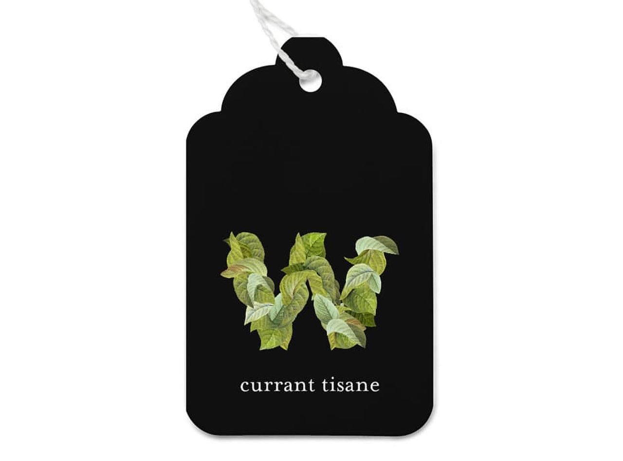
A deep black topped with a mix of vibrant greens displays the depth of this brand of organic fusion teas. The intricate combinations of tea leaves brought together to form a "W" are contrasted by a simple yet effective title line. Finally, a gradual size increase from the top of the tag naturally draws the eye towards the shape and title, which makes it one of the very creative hang tag examples.
14. DARK WOODS COFFEE
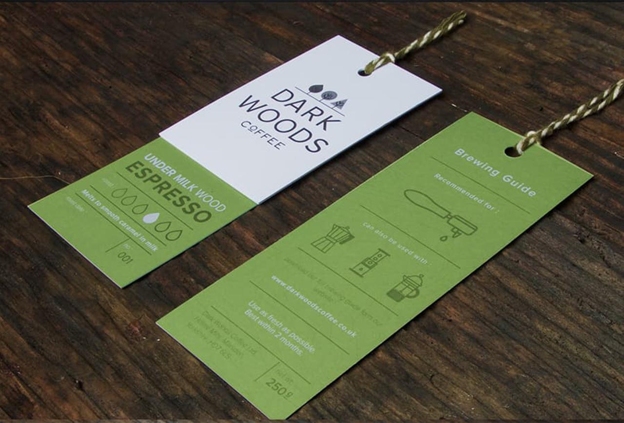
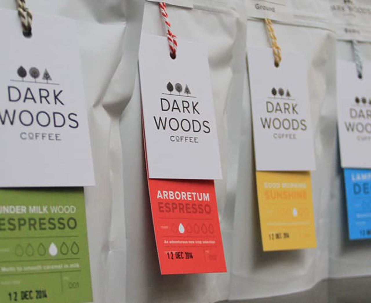
These tags demonstrate the hang tag's potential to convey a lot of information in a small amount of space, and they look good doing it. The basic designs of objects are clear enough to be recognizable and minimalistic enough to take up as little space as possible allowing for an effectively empty background. All of this allows the tag to feature the roast level, recommended equipment to use, best before date, and more. The colors contrast well with each other and the designs maintain their modern simplicity throughout - reflecting the brand's very same personality.
15. FABRICS
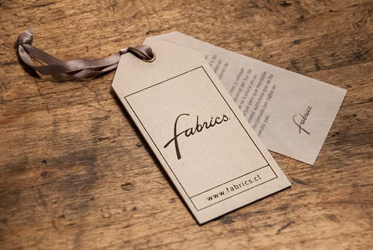
Almost resembling an elegant business card, these hang tags convey quality, and taste. The well-made fabric replaces a rope to attach the tag and reflects the kind of quality the customer can expect. A simple border surrounds the cursive logo and a small separation highlights the website. Inside, the tag features easy-to-read text and repeats the logo to reassure the brand.
16. CAT EYES

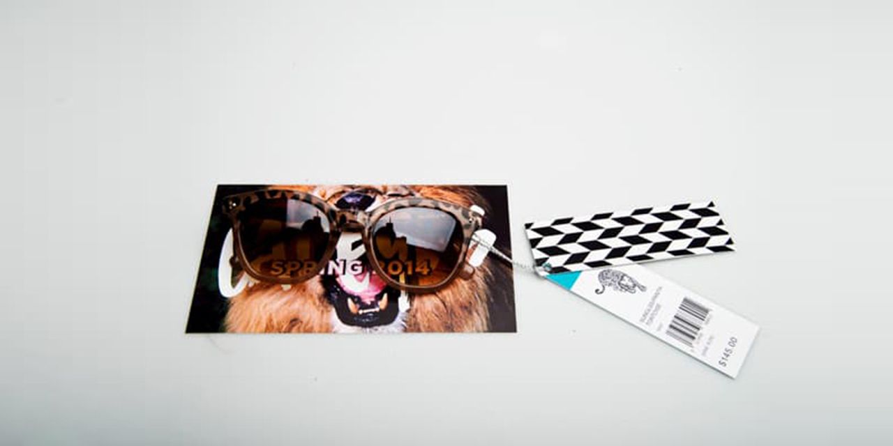
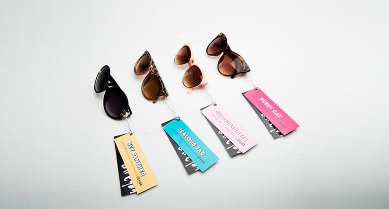
What makes these hang tags stand out is the writing. Each tag features a phrase that acts as both a reflection of how the product makes the consumer feel and a title. This adds true excitement and intrigue to an already vibrant tag. Although these hang tags are a traditional rectangular shape, the content on them gives them true value.
17. CANVAS JUNE
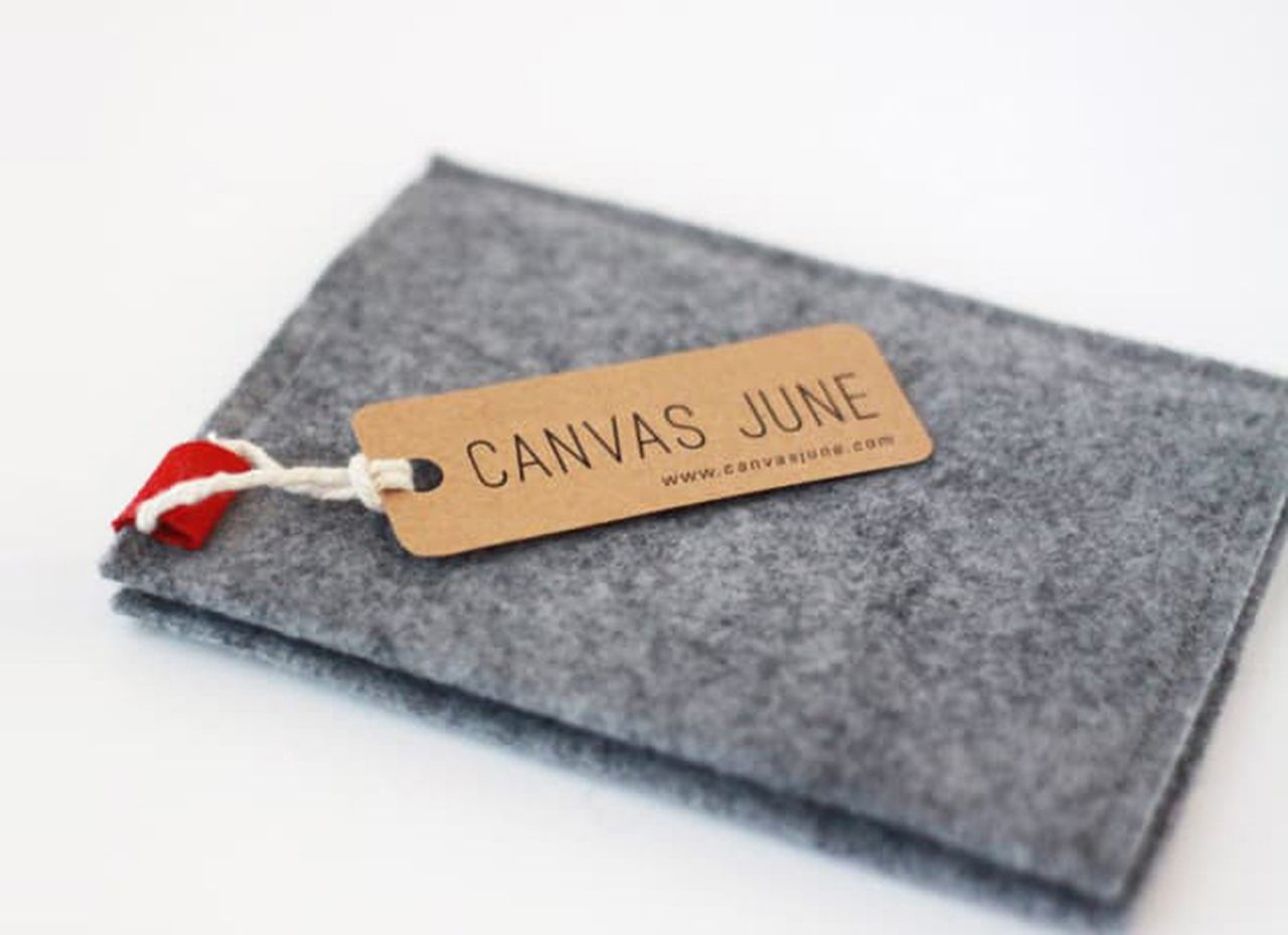
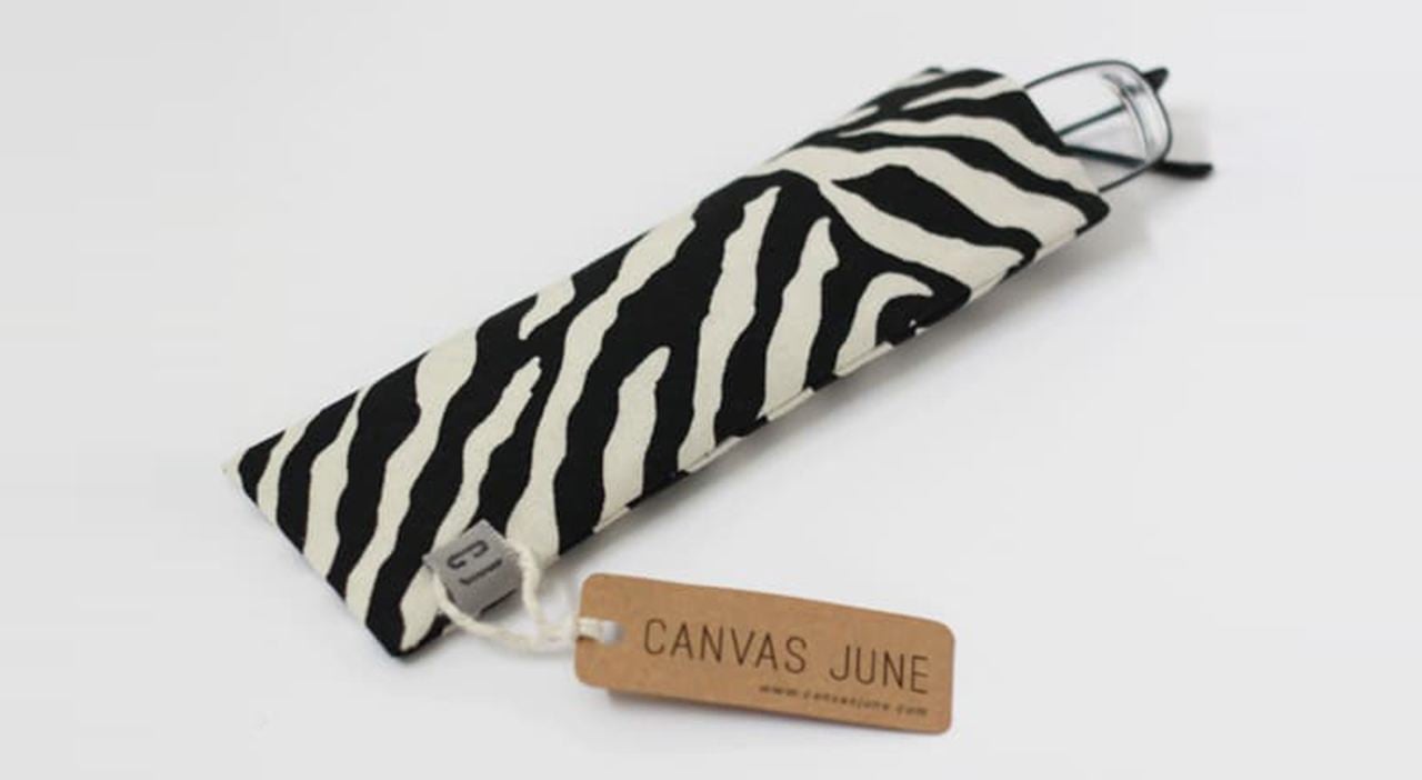
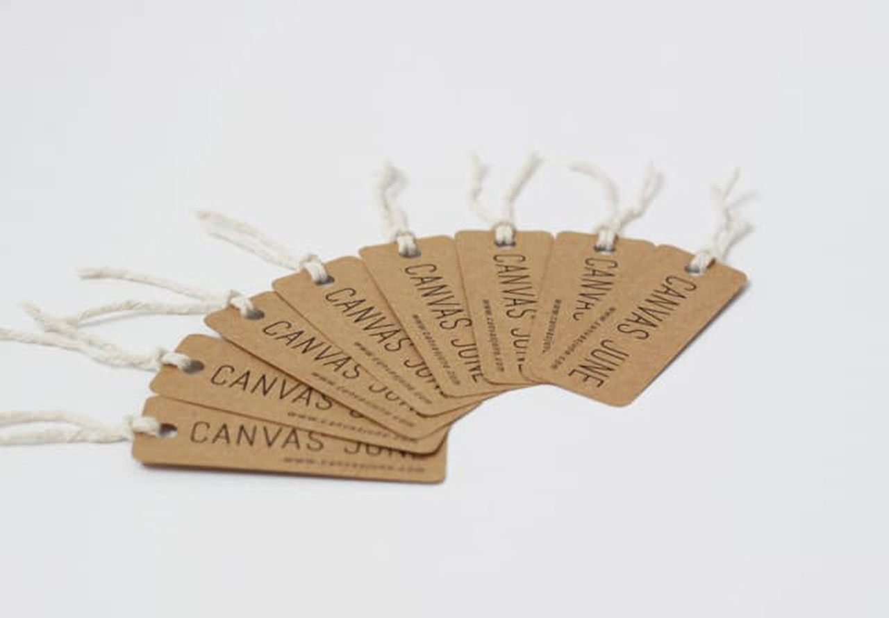
These simple hang tags have a perfect contrast to their products. Handmade items from New York design company Canvas June make the earthy brown of the tag pop. Simple typography puts the finishing touch on this alluring tag. This tag serves more as a souvenir and an enticement to shop further with Canvas June than an additional pull like in-store tags.
18. CALENDAR HANG TAG
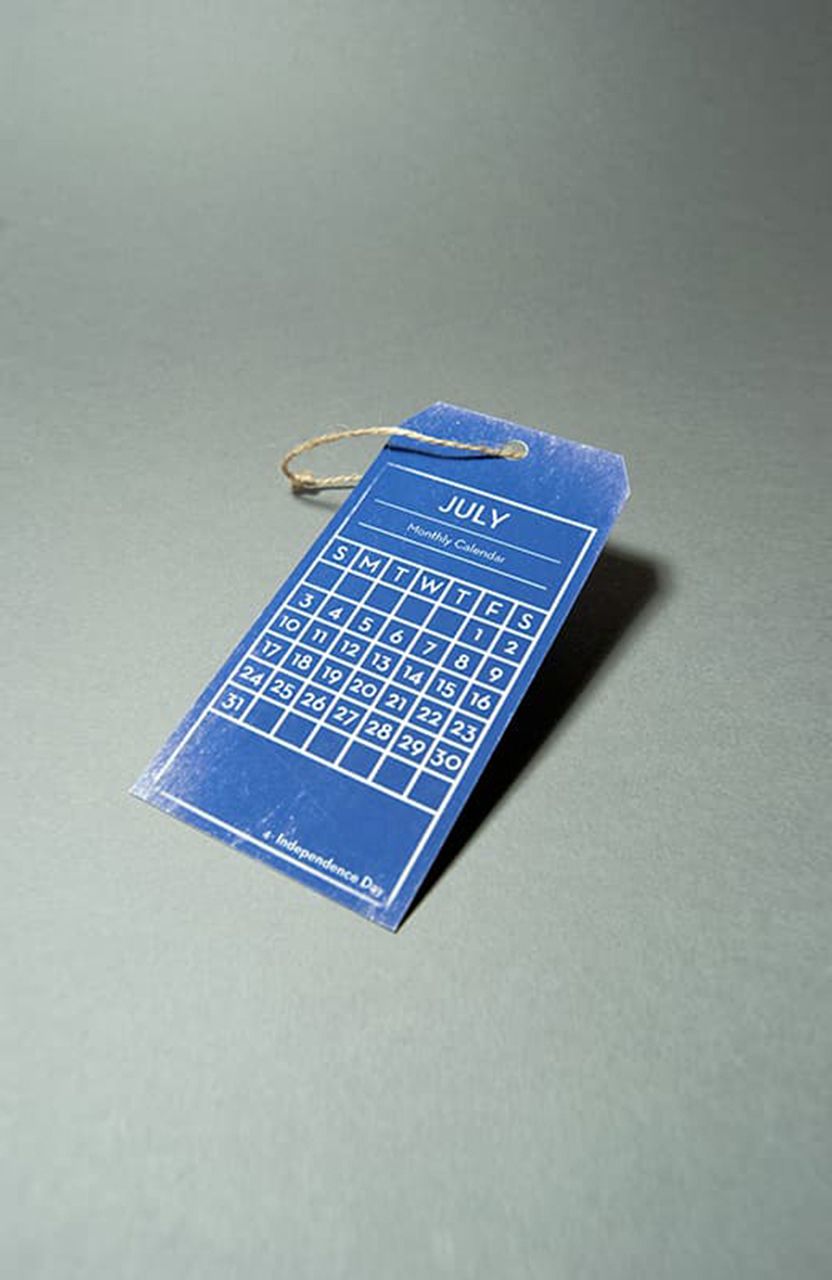
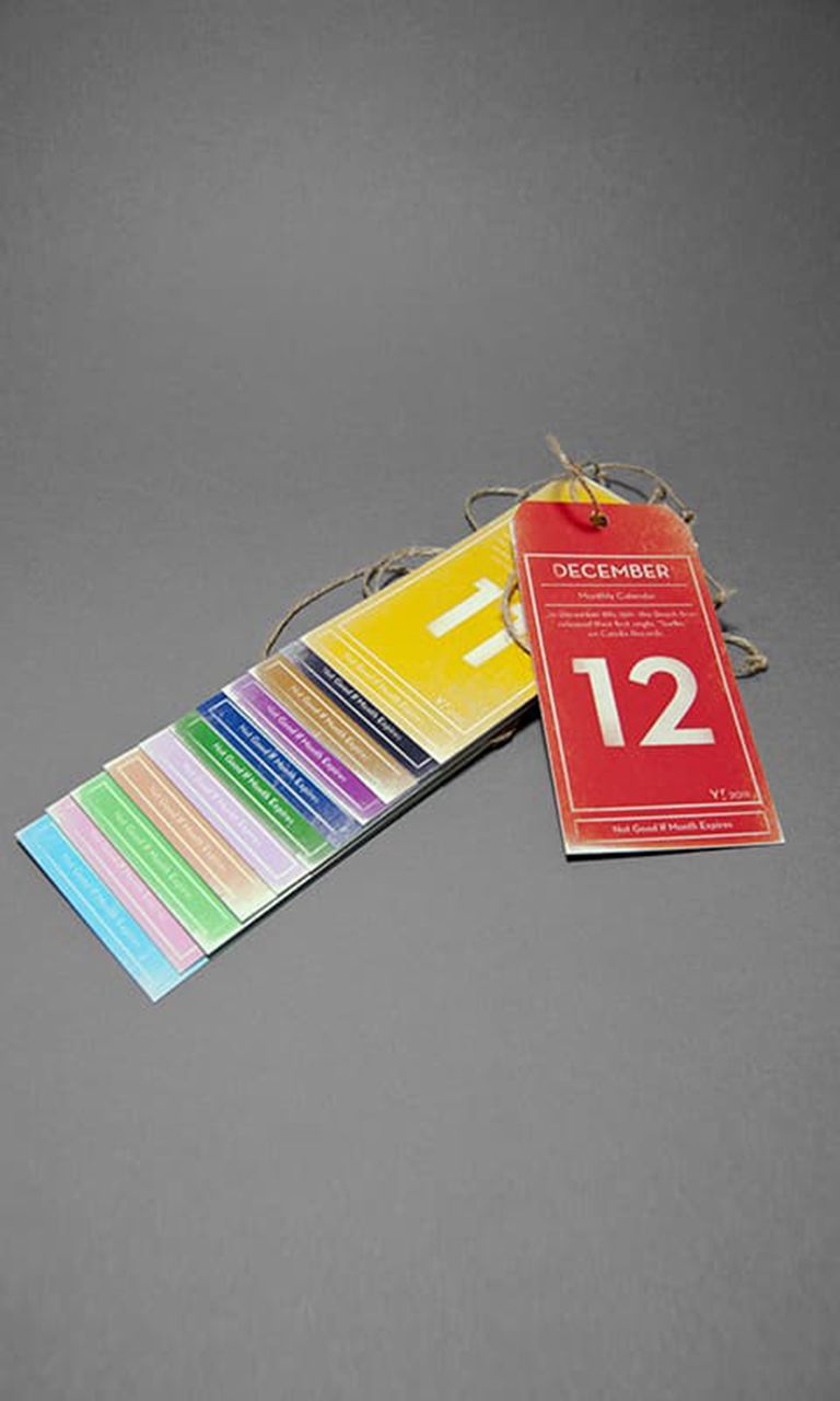
These calendar tags by graphic designer Mitch De Guzman bring a "free gift" feel to any product they adorn. Faded and well arranged, each hangtag features a month calendar, information about the month, and any important dates within. A tag that can be kept, displayed and even used goes so much further than just a draw - it's a souvenir that is a constant reminder of your product.
19. EIDON
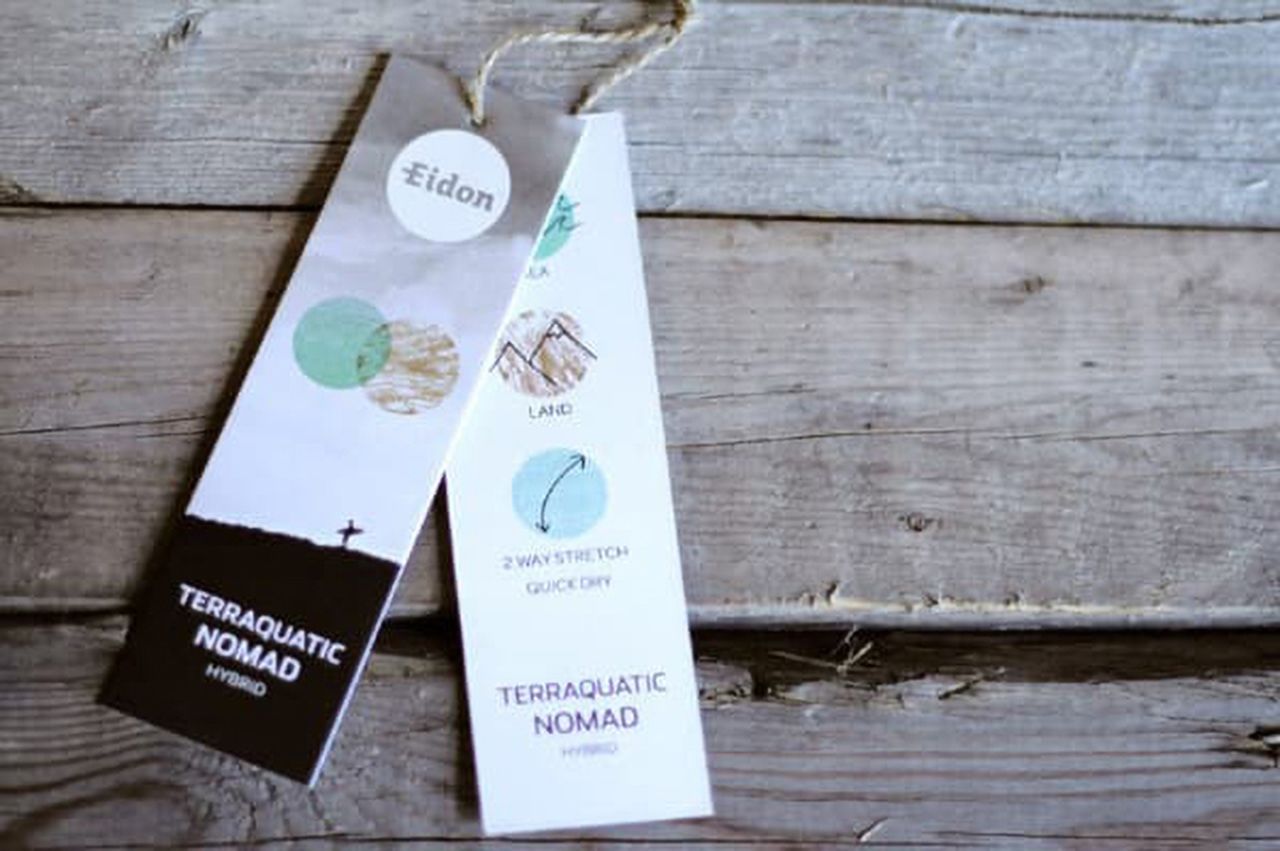
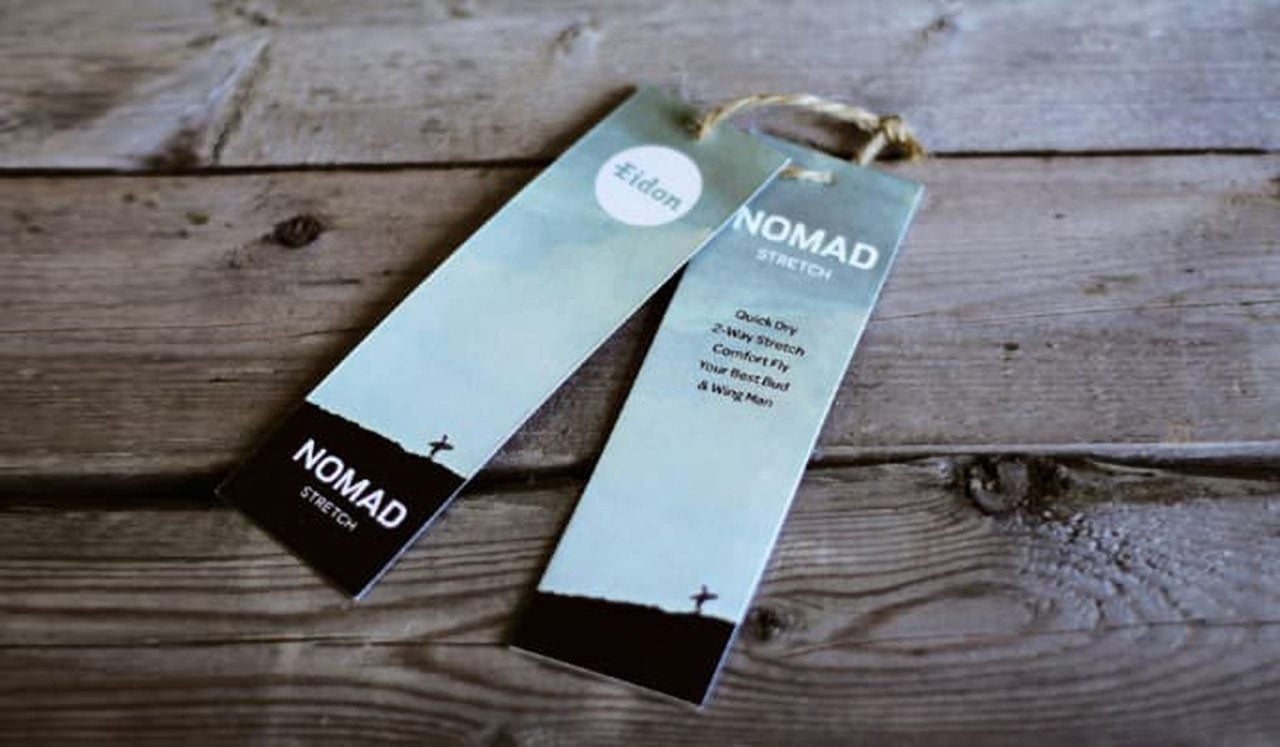
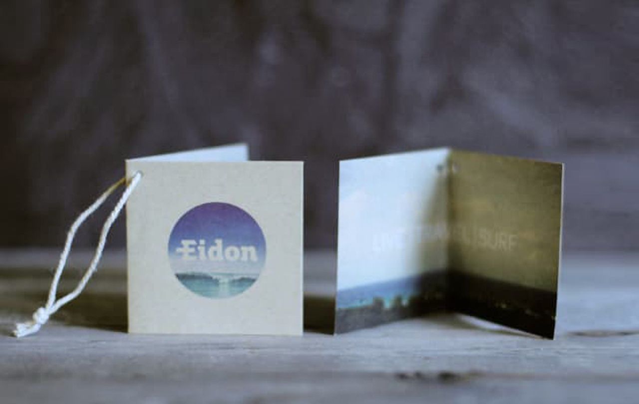
Featured here is a beautiful landscape and the small, yet recognizable figure of a border traversing the terrain. Eidon, the outdoor clothing company behind these hang tags, makes good use of the landscape contrast to highlight both the brand name and the product name. Along with this, the stylistically colored shapes serve as an effective and unique way to highlight the benefits of the product. This example shows effective use of folded hang tags.
20. BUDWEISER
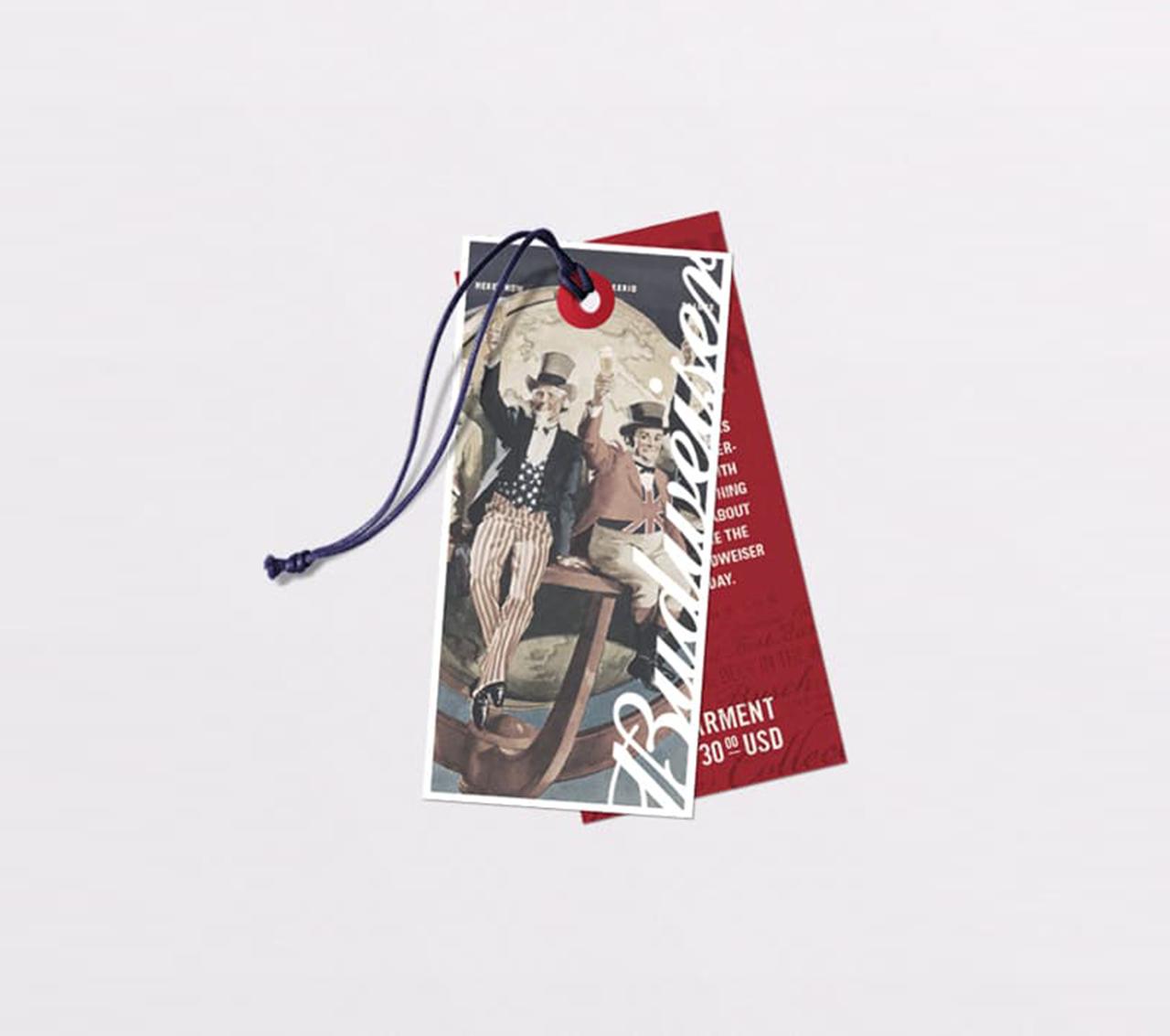
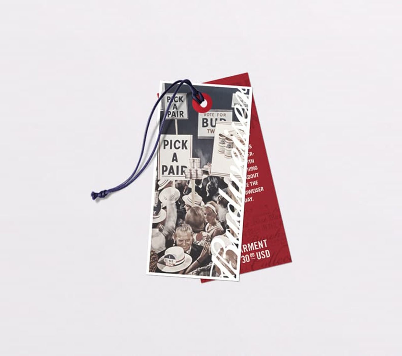
A classic, historical theme highlights these tags. The front and rear hang tags feature effectively contrasting colors. Each tag features a vertical logo that allows consistency while the image remains unique. A bold white border makes the image colors pop and the back tags fading background texts draw the eye all around the tag.
Have these hang tags examples inspired your own hang tags ideas? Go to our hang tags product page to get started on the perfect custom hang tags for your amazing product!
