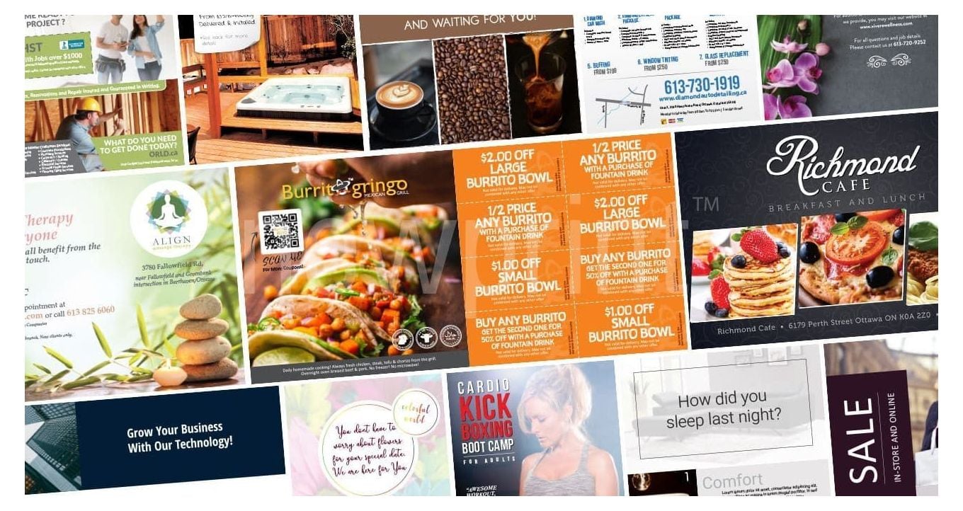
We have noticed some common flyer design mistakes and want to share some flyer design ideas to help you avoid them and run an effective marketing campaign.
Having a well-designed flyer is essential for running a successful campaign. Although it is not the only important element, customers are less likely to even read your message if the design is not done right. This is why we are sharing with you some of the flyer design ideas we think will help you make your campaign impactful and relevant.
What Does a Flyer Look Like?
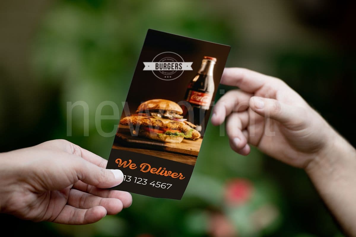
A flyer is unfolded single printed sheet usually used to draw attention to a service, product, or event. A simple message that can be conveyed quickly is the best option for flyers, in a size that is easy to handle. They’re often handed out on the streets, exhibitions, and events. There are usually just a few seconds to connect with the customer, so a good flyer design needs to be visually compelling.
Flyers are extremely cost-effective and efficient for promoting your product, brand, or event. This makes them very attractive for businesses that have a limited budget when targeting a specific regional audience. They are mostly printed in full colour since their purpose is to get noticed, and double-sided to include more information and visuals.
Although flyers are usually distributed by hand, there are situations when they can be enclosed in an envelope and mailed. In these situations, they are usually printed on thicker paper to make them more durable. This is a case when a flyer contains information that can be referred to more than once, such as instructions or product specifications.
Flyers, Rack Cards, or Brochures?
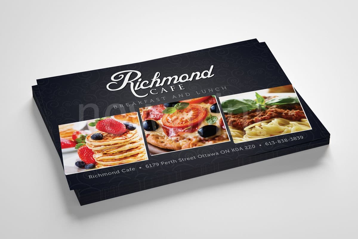
People often consider flyers, rack cards, and brochures the same thing. But, there are some differences, which are not hard to remember. Flyers and rack cards are flat (unfolded), and brochures are folded. Flyers are mainly used for promotions and one-time events, designed for large volume hand-outs, while rack cards are usually better suited for longer shelf life and are printed on card stock. Brochures are usually distributed to people who have already shown some interest in the company.
Flyer design ideas and mistakes to avoid
These flyer design tips should help you avoid the most common mistakes we saw in flyer design. There is no one recipe that is sure to work, but there are flyer design principles that you can follow to get a good result.
1. Dull Headline
It’s natural to want headlines on a flyer to be factual or shout out something about your company. Perhaps simply your name. This approach will most likely fail to grab a reader’s attention and a customer will not even read the rest. Consider titling your flyer with the benefit of being your customer. For example, if you’re a delivery service, something like “Bringing you what you need, so you can focus on what’s important.” will most likely have a better impact.
2. Lifeless Lists
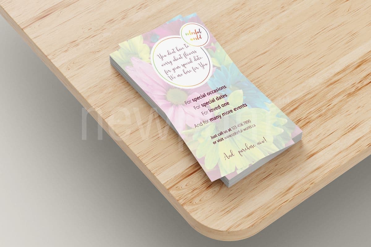
Everyone makes lists. And what consumer doesn’t like a list of products or services to choose from? The question is - why would they be interested in spending time to get to know what you have to offer in the first place? Why would a stranger who has never heard of you give you a chance?
One of the most useful flyer design tips we have is to make an effort to describe the problem(s) you’re solving. You want this to be as unique as possible. Reading this should help a potential customer distinguish you from your competition.
Sticking with our previous example, let’s pick grocery delivery. Most people wouldn’t pay a premium for grocery delivery if you just put it plainly. But, they probably would pay more to be able to prepare a meal without having to fight their way through a crowded supermarket. Being able to come home, quickly prepare a delicious meal, and enjoy quality time with their family is something most people will consider valuable.
3. Strictly Business
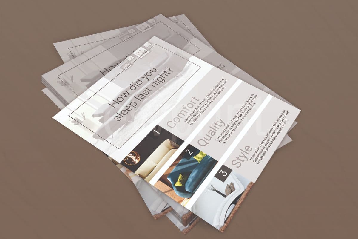
Relationships are just as meaningful in as they are outside of the business. People want to feel good about who they’re doing business with. Take advantage of being a smaller or family-owned business and let the reader know a little bit more about you. What qualifications or values make you different from your competitors? If you’re providing a service, this might be your ability to complete jobs quickly. Or your commitment to a one-hour response time. A little bit of personality can go a long way in creating a connection and getting a repeat customer.
4. Passive Phrases
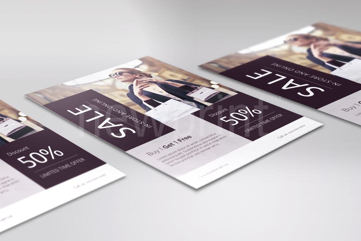
The purpose of advertising is to urge someone to action. Yet we’ll still see flyers end with phrases that include “for more information” or “look for us at.” One of our flyer design tips is to add a date driver if your flyer is meant to drive a timely reaction.
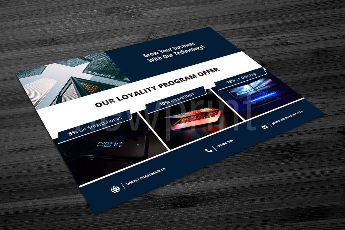
Provide a reasonable amount of time to allow busy customers a chance to come, but do not overextend it. You want the customers to know they have to react soon to benefit from your offer. Also, customers love a bargain. Whether it’s the words free, percent discount, or dollars off a purchase, you need to make sure they know it’s a one-time offer they don’t want to miss. Remember to balance the impact on your margins relative to the increase in sales before choosing the pricing benefits you wish to provide.
5. Wasted Opportunity
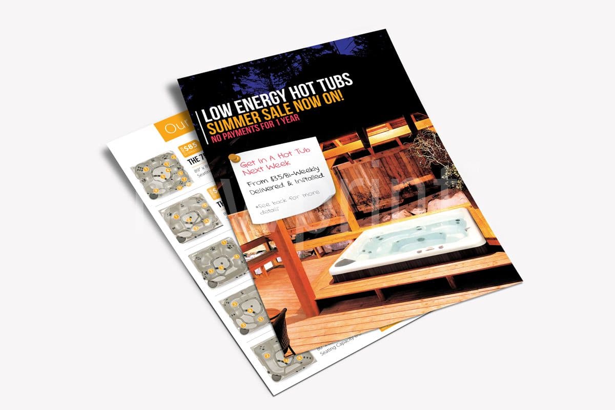
Once you have your potential customer’s attention, don’t leave them hanging with a one-sided flyer. Take advantage of the opportunity to support your message with more details, tell them how to find you, or provide helpful advice. This also prevents someone from mistakenly throwing away your ad if they receive it blank-side first. Some examples might be:
- A map of your locations and directions from major landmarks
- Photos of your work
- How to’s for simple DIY projects
- Answers to frequently asked questions
- Customer quotes or industry compliments
6. Everyone and Anyone
It’s easy to feel the need to blast your message far and wide. But this may not be the best strategy for everyone. For example, pet care specialists should target neighbourhoods with a high concentration of pet owners. These businesses also benefit from focusing on building a clientele in nearby areas, maximizing the use of their time, and saving money on transportation.
If you provide similar on-site services, consider first targeting areas your current customers live in, and those most easily accessible. Don’t worry if you end up sending flyers to your existing customers. Just include a sentence to encourage them to pass the flyer along to a friend. You could even consider a small discount for their effort if their friend becomes a customer.
7. One-hit Wonders
The power of threes shows up in the marketing world as well. The average person needs to be contacted at least three times before they can even pick you out of a lineup. Running one advertising flyer campaign is not enough to grow your customer base. A good tip is to get creative with your follow-up campaign. Perhaps reach out to office buildings or public buildings. Grocery delivery services may consider putting posters at a local store. Sometimes reading the same material in a different environment can result in a different reaction.
8. Assuming Success
After putting in the effort to create your best marketing materials, the last thing you want is to hope for the best and assume you’ve got the process down. Put a few controls and metrics in place so you can measure the impact and continue to improve your campaigns in the future. It is a good idea to include a call to action. This will give you a response that you can track. It can be in the form of coupons, vouchers, or promo codes. If the call-to-action is to order from your website, you can create a sub-domain or a landing page to measure traffic generated by the campaign.
The best measure of success is an increase in revenue. Simply comparing the number of visits and total purchases during the flyer campaign to periods without campaigns can help you understand your advertising impact. To compare the effectiveness of different wording or flyer design, run two campaigns simultaneously and track individual responses by asking customers which flyer they received.
Where to find flyer design ideas
Searching the internet for the inspiring works of other designers is always a good idea for getting yourself in a creative mood. Of course, we do not suggest copying anybody. But there is nothing wrong with finding flyer design inspiration in the works of others. You can also see what is trending at the moment in the design world. This can help you create marketing materials that will draw attention and have a modern flyer design. We love Adobe’s creative flyer design ideas, and there are many more inspiring websites that have different ideas, like Canva or Pinterest.
Putting in a little more effort up-front will help ensure that each of your advertising flyer campaigns increase your sales and effectiveness with every run. If you have a ready design, visit our Flyers product page and see our wide range of options for flyers printing. When you choose the specifications of the product, you can download our flyer templates. This will help you create print-ready files. If you would like our designers to help you with flyer design ideas and creating eye-catching marketing materials for your campaign contact our support team and let us know what you need.
