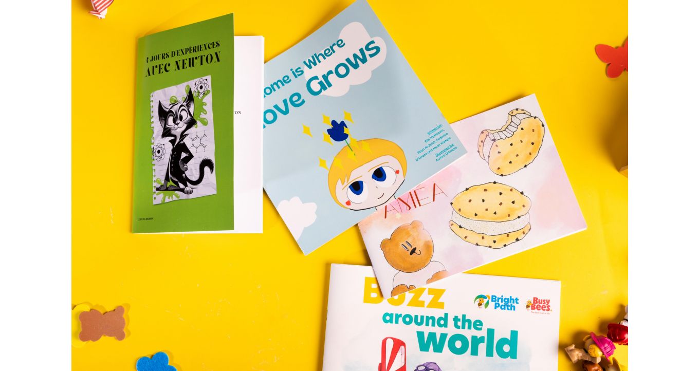
Children's books are a fantastic way to inspire and educate young readers, and many people aspire to write them. However, we understand that getting your work printed can feel overwhelming for aspiring authors. This is why, in this article, we aim to offer printing information to authors and illustrators, providing them with an understanding of the printing options available.
Making Your Book Stand Out: Adding Fun and Creative Touches
Children's books should look fun! You can incorporate delightful elements to enhance their appeal.
The Importance of Covers
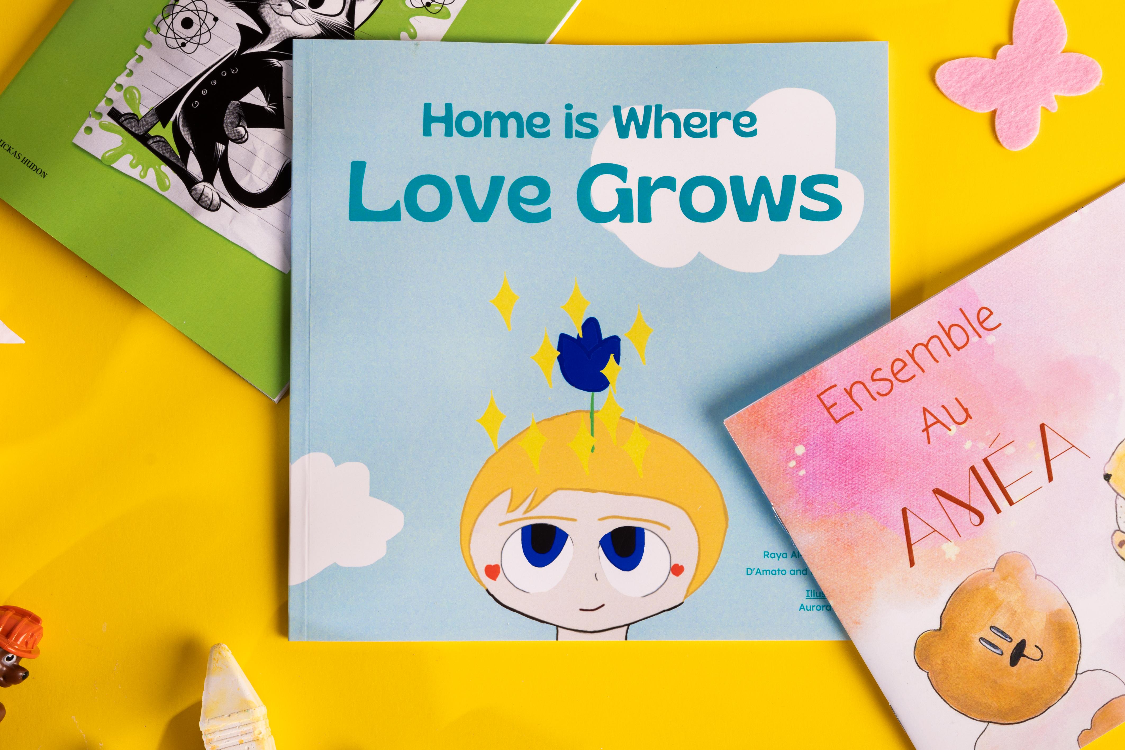
The purpose of a cover is to grab the reader’s attention. For young children, colorful illustrations and different textures are captivating.
You can have a lot of fun with a book's title. The title's size and prominence provide an opportunity to be creative and use a whole host of exciting fonts to represent the book's content. For example, if your book is about a kid gifted a magic crayon, the title can be designed to look like a crayon drawn.
The cover paper can also provide an opportunity to add textured finishes.
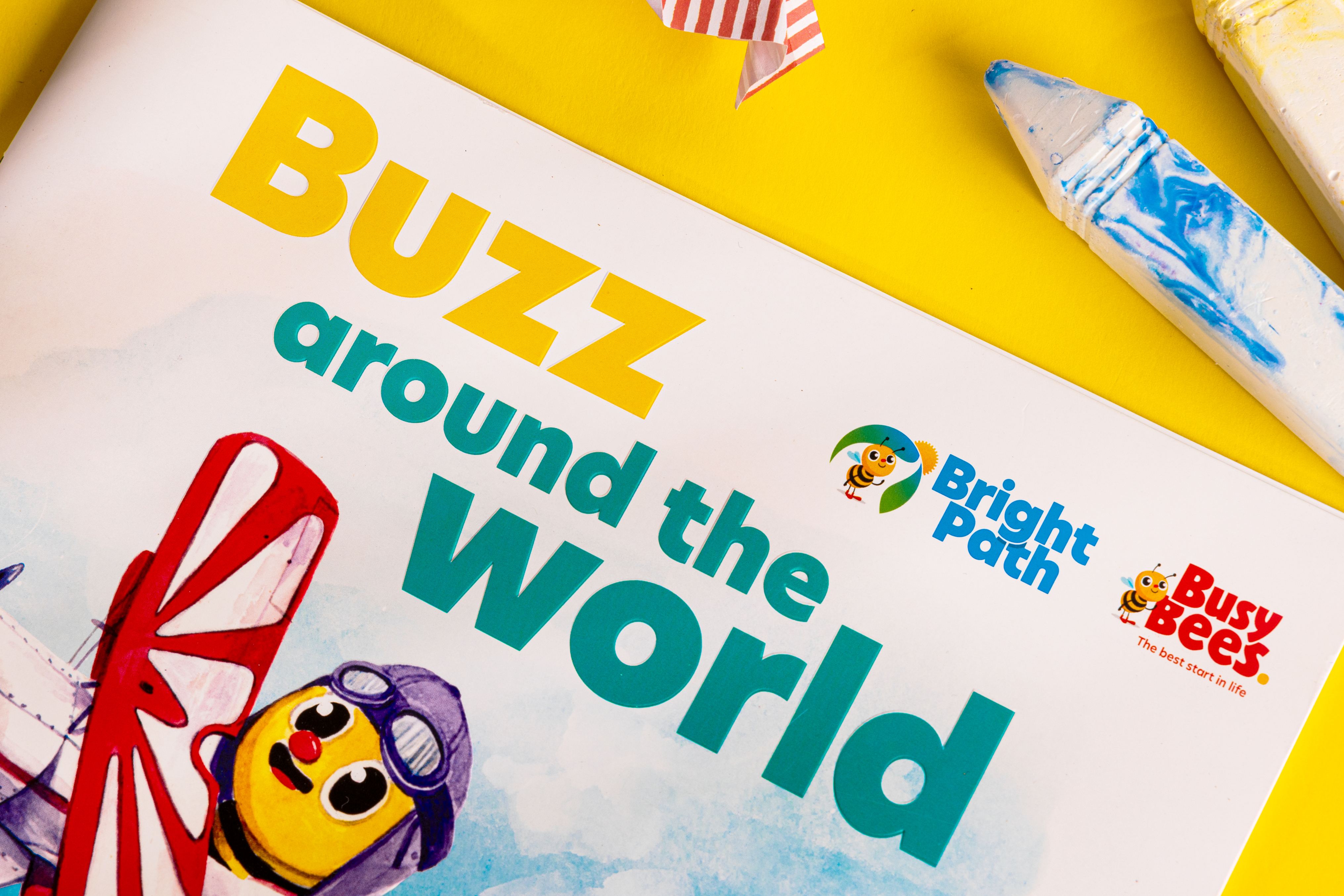
Embossing is a technique for creating a three-dimensional effect on the paper's surface. It is often applied to the titles of children's books or specific areas of artwork. For instance, in a book about basketball, the printer might use embossing to enhance the ball illustration, making it appear more round and stand out from the rest of the image.
Coatings provide texture to the paper. A glossy coating adds a shiny finish, while a soft touch adds a velvety texture to the book.
The Print Decisions for the Content of the Book
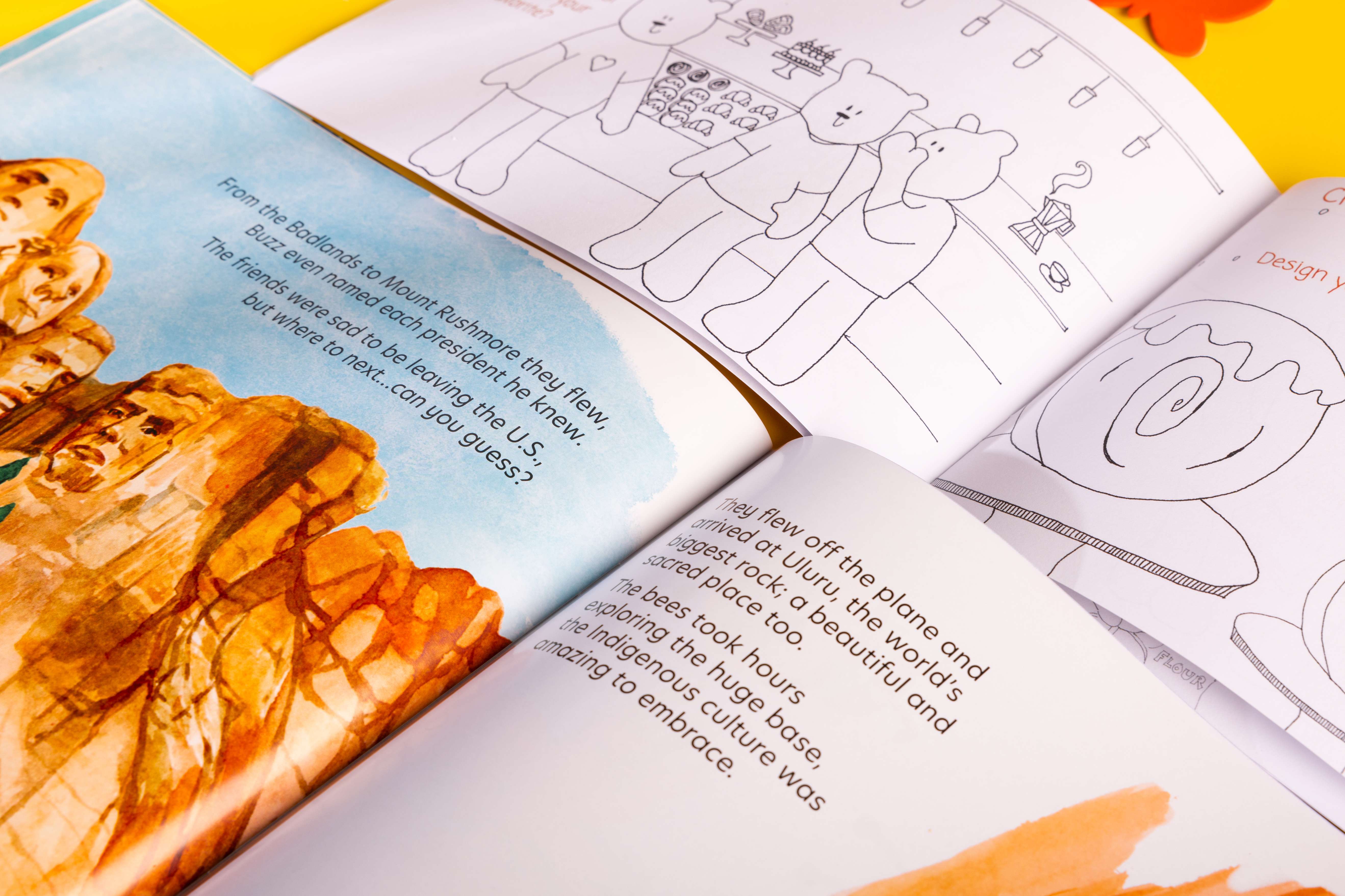
Inside pages are where you can decide whether you want your books to be a storybook or a coloring book.
A storybook or picture book contains narrative-driven short stories or straightforward educational content, which is often what you think of when somebody says children's books. Glossy paper is recommended for these books, as its shiny coating will make the colours in your artwork bright and beautiful.
Colouring books are an excellent way to engage children with the content. These books feature pages filled with intricate line art and open spaces, along with instructions on what to draw, fostering the child's creativity. For the best coloring experience, we highly recommend Uncoated Stock paper, which complements crayons and colored pencils beautifully. This paper type enhances the vibrant colors and detailed work, making the coloring experience even more enjoyable and rewarding for the child.
Binding it together
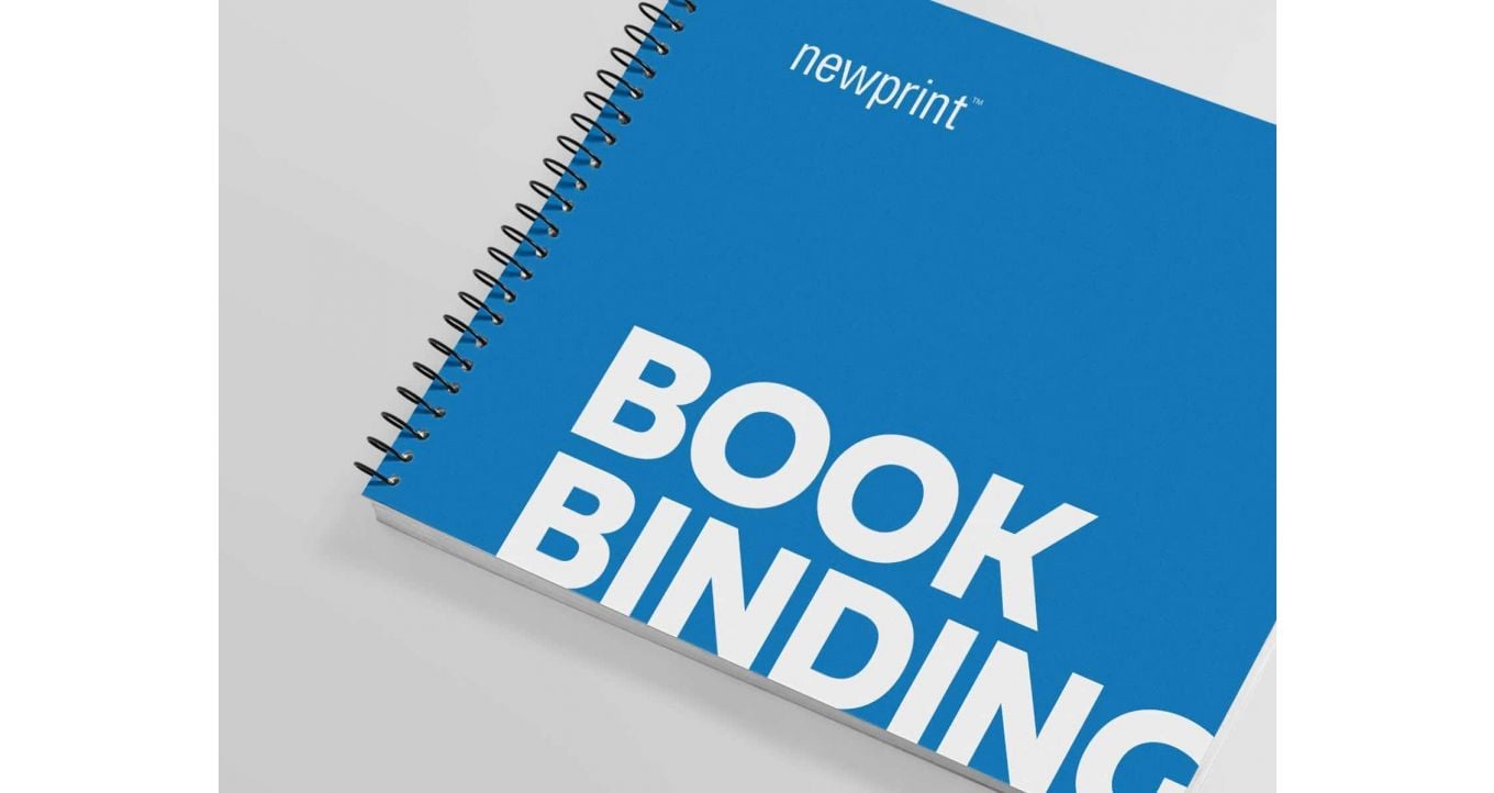
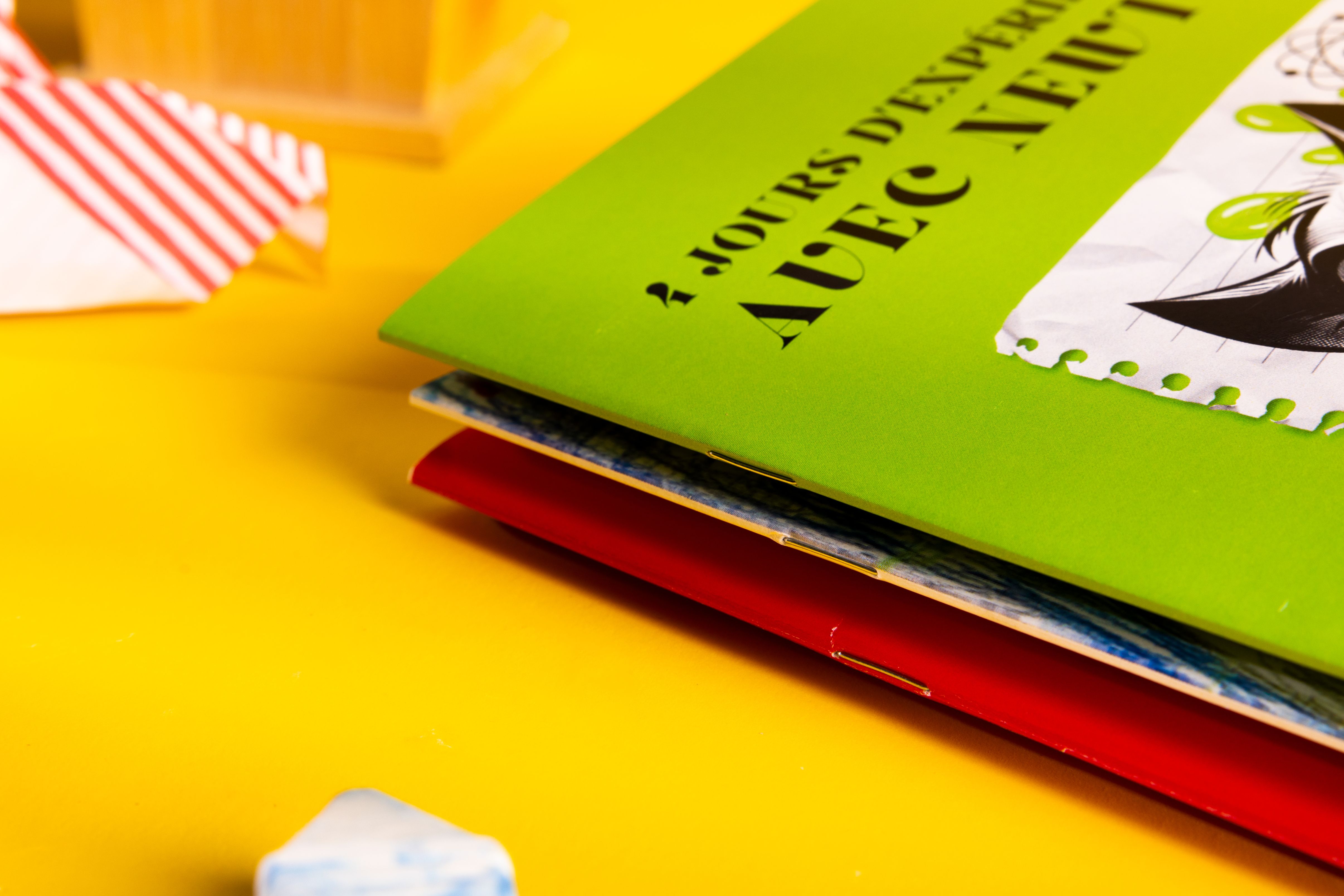
You can even get creative with bookbinding. Two popular styles for children’s books are saddle-stitched and spiral-bound.
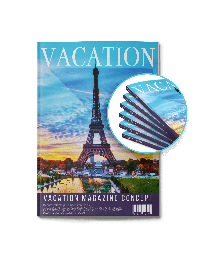
Saddle-stitched books are the more common option for children's books. They are bound together by either staples or stitched with actual thread.
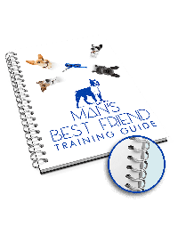
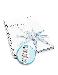
Spiral-bound books are bound with a coil in a continuous spiral shape. This binding method offers the option to choose the color of the coil.
Considerations to take with your Book
Things to keep in mind
The number of pages for saddle-stitched books should be a multiple of 4. The typical recommended length is 32 pages, including the cover. However, this rule does not apply to spiral-bound books, as the coil can accommodate them.
The cover paper should be thicker than the book's inside. A popular choice of paper stock to use is 100lb glossy.
Dimensions of a Children's Book
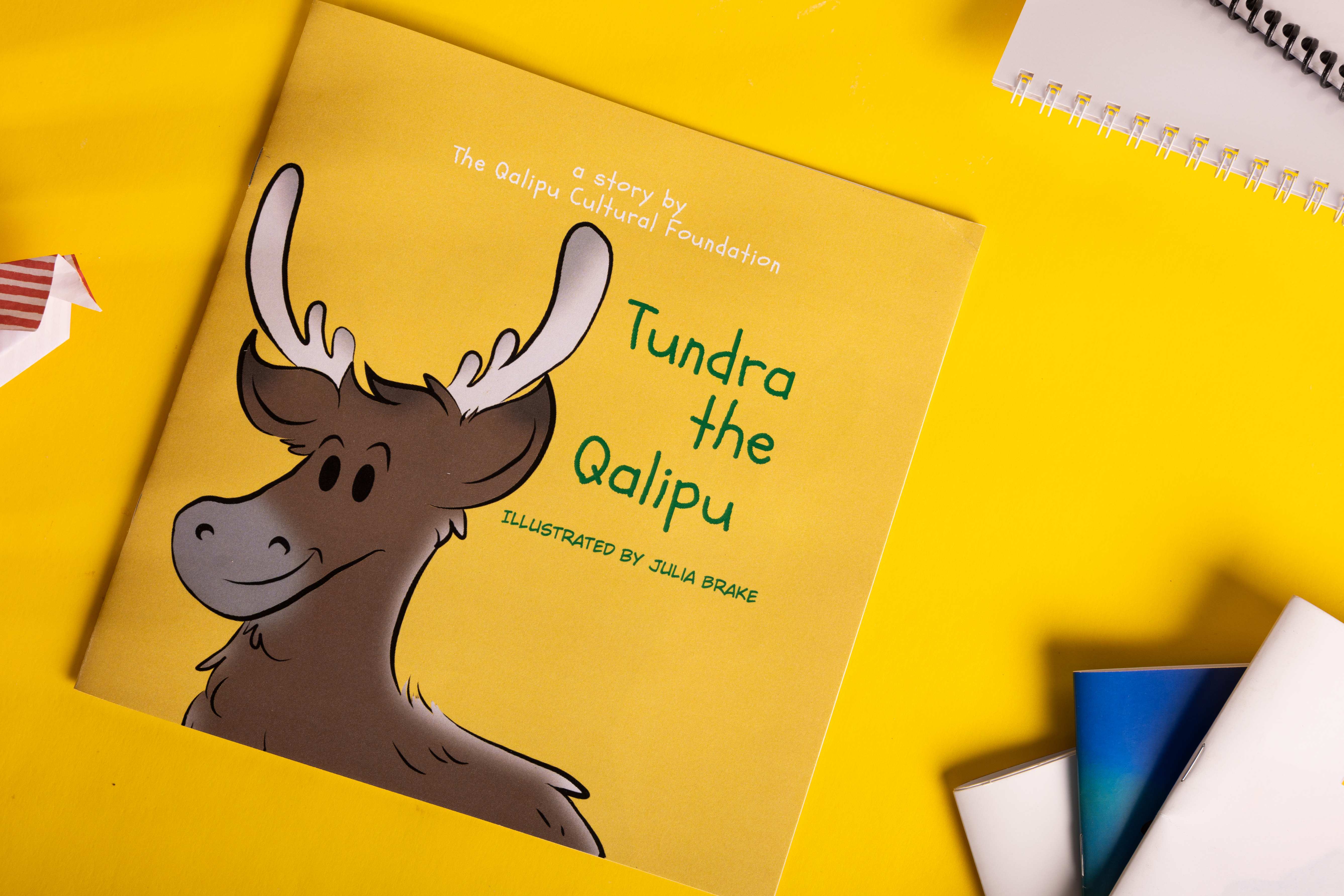
Square
The height and length of the book are the same.
-
8 x 8 inches (20.3 cm x 20.3 cm)
-
9 x 9 inches (22.9 cm x 22.9 cm)
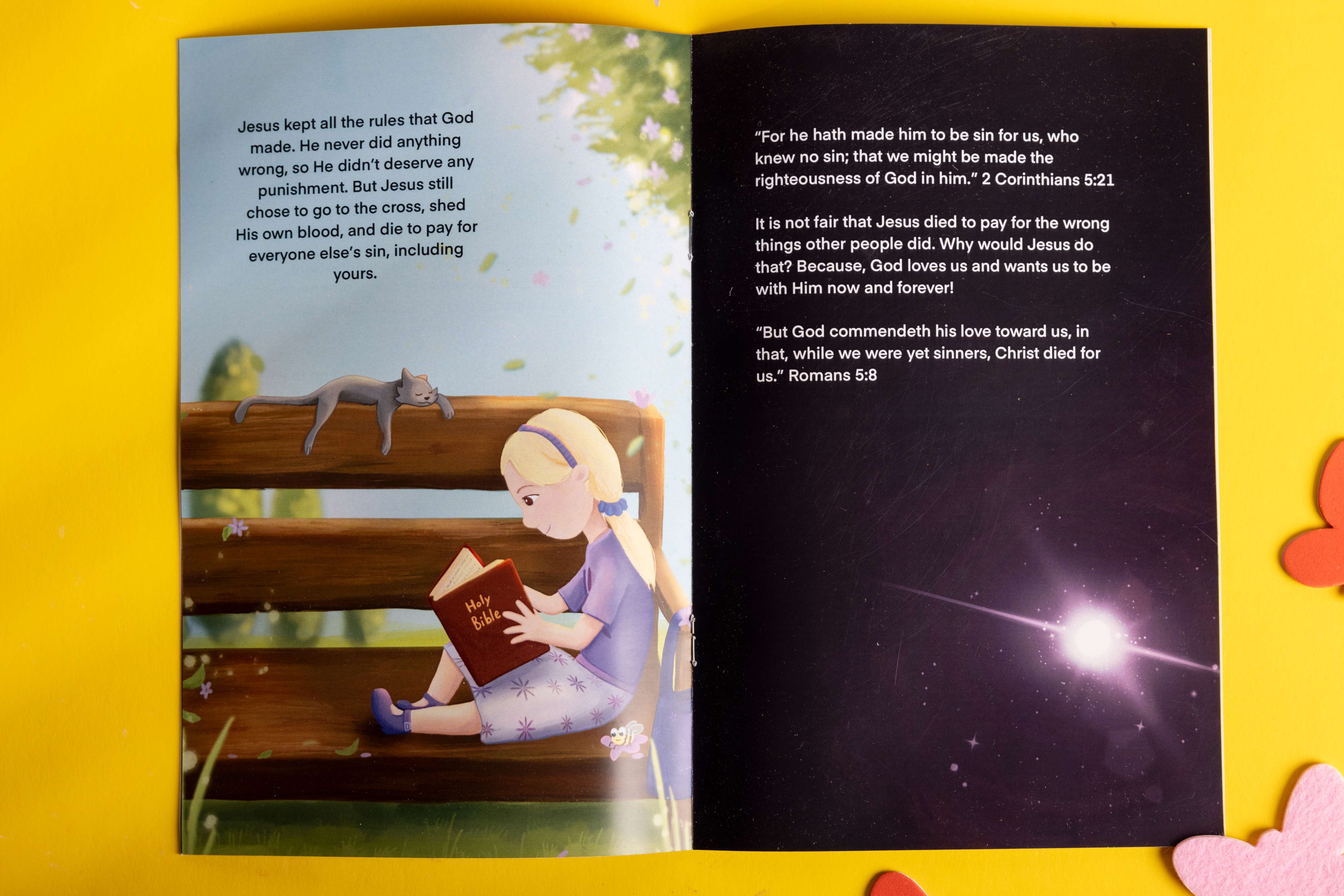 Orientations:
Portrait
The height is larger than the length
-
8.5 x 11 inches (21.6 cm x 27.9 cm)
-
5.5 x 8.5 inches (13.5 cif.6 cm)
Landscape
The length is larger than the height.
- 8.5 x 5.5 inches (21.6 cm x 13.5 cm)
The Text
The recommended size for titles is 50 to 60 pt, depending on the font.
For the text within the book, we suggest using a font size between 30 and 40 points. It's recommended to use an easy-to-read font with little fanciness. A sans-serif font is ideal for this type of book. Here are some excellent examples you can use.
-
Poppins regular weight
-
Quicksand Medium weight
-
Nunito regular weight
Here are some tips for adding text to your images:
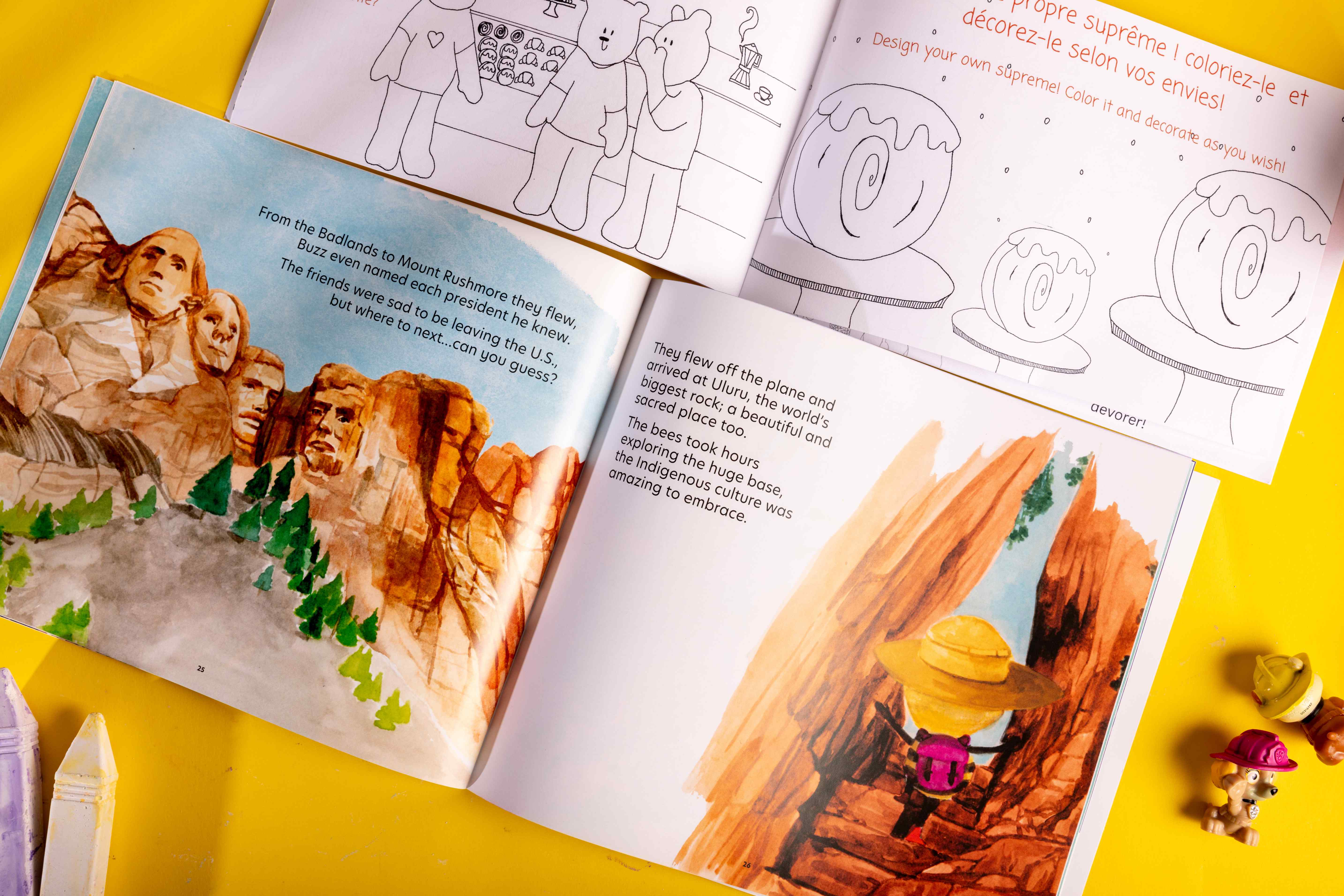
1. Make sure your artwork leaves some blank space or a solid colour for your text.
2. Use dark letters on a light background and light letters on a dark background to keep your text legible.
How to Set up Your Book
The industry standard for creating or editing images is Adobe Photoshop or Illustrator, but you don't have to use them if you don't want to. There are several similar alternatives available. You can use InDesign or similar alternative software to create your final layout and text.
I suggest making two layers in your layout document: one for artwork and the second over top of it for your text. Place your images into the layout software.
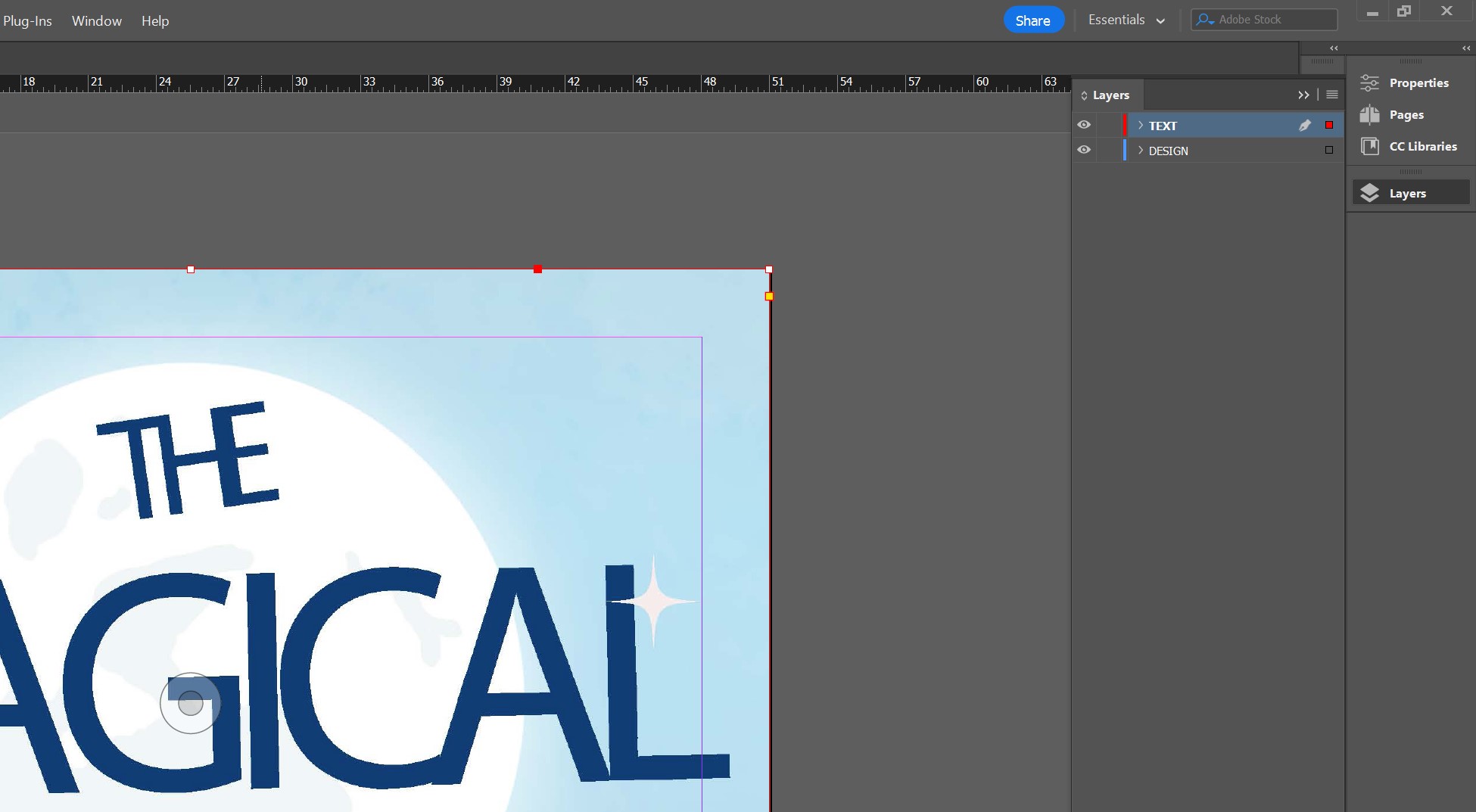
When you are done, export a PDF of your book, set it to print, and make it at least 300 dpi to print nice and clear.
Conclusion
We hope this will be helpful to you and your book printing journey. If you need printing press services, Newprint.ca is here to support you in bringing your book to life!
